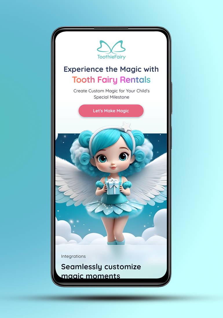

ToothieFairy
ToothieFairy is an imaginative UX/UI design concept for a tooth fairy service that transforms the traditional tooth-loss experience into a magical adventure. Through personalized letters, enchanting gifts, and bonus features, ToothieFairy aims to make the tooth fairy visit a delightful and memorable event for children and parents alike
The Challenge 🎯
Although an imaginary concept, I approached this project focusing on real parent and child needs around losing teeth. Research showed that many parents struggle to balance busy lives with creating special tooth fairy moments. This led to an opportunity for a solution that magically handles the hard work for them.
Work Process 🔍
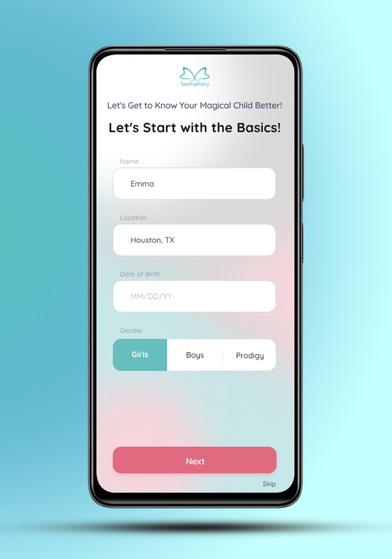
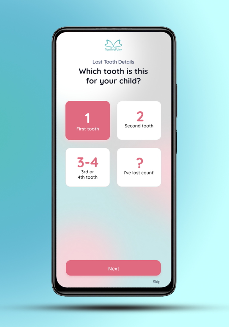
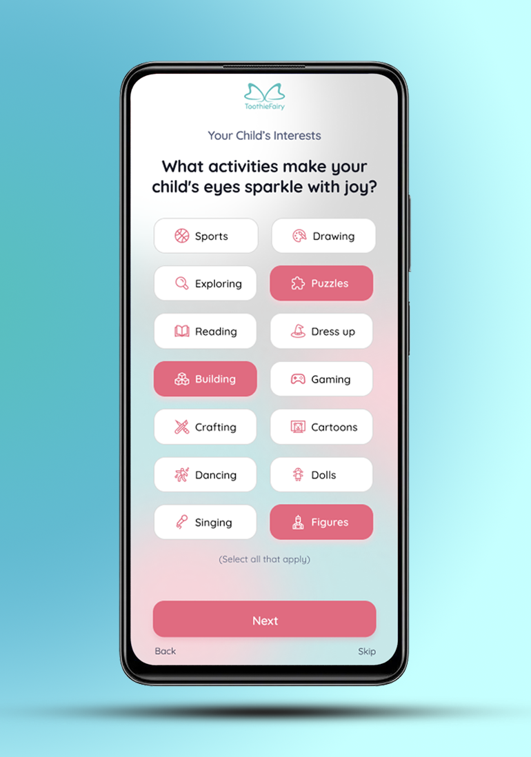
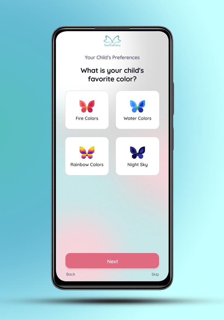
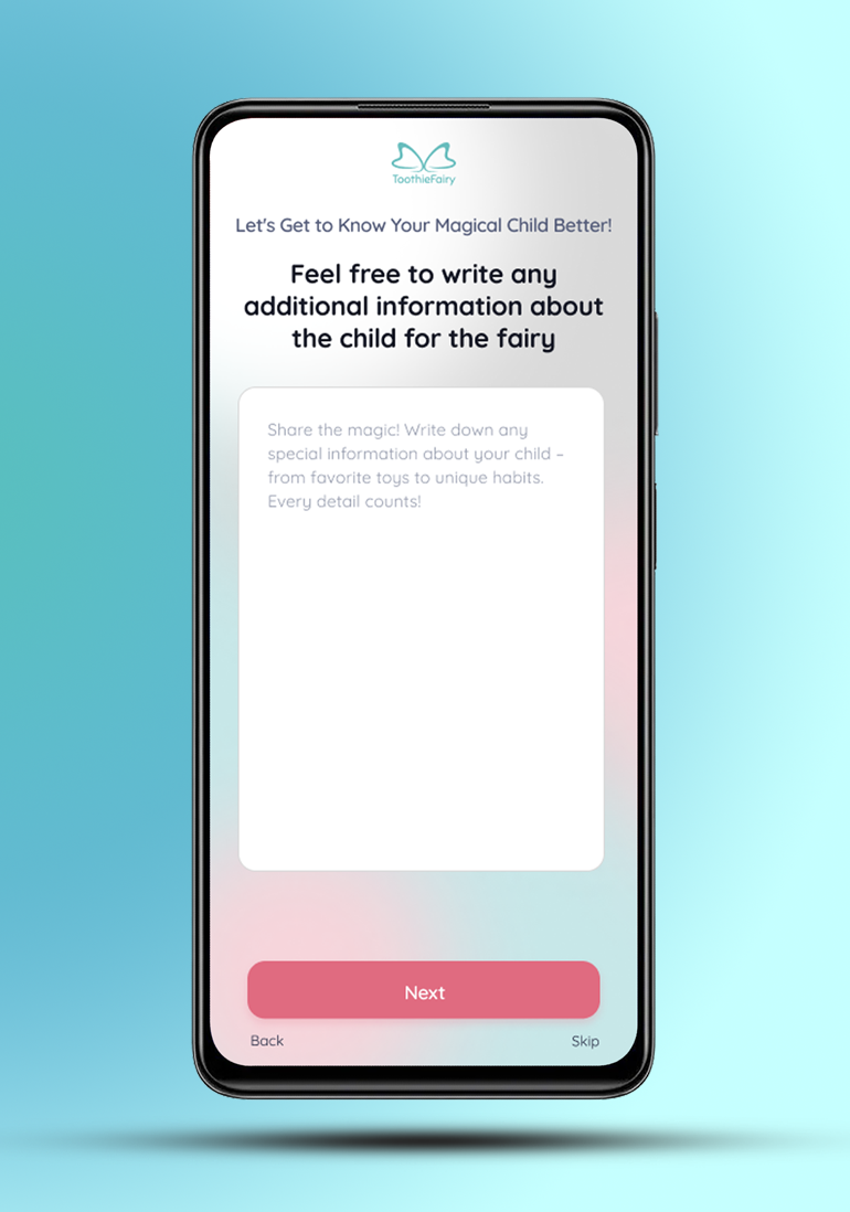
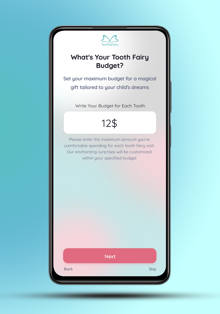
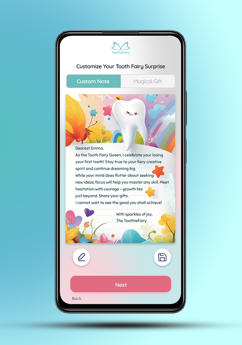
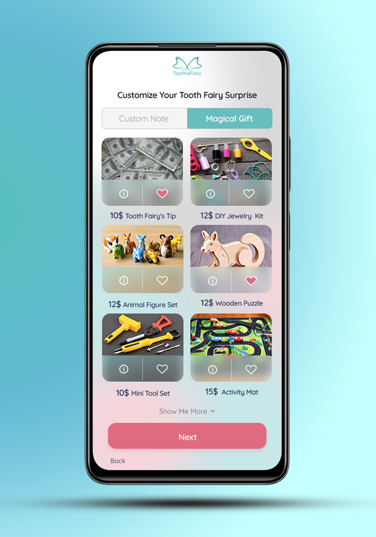
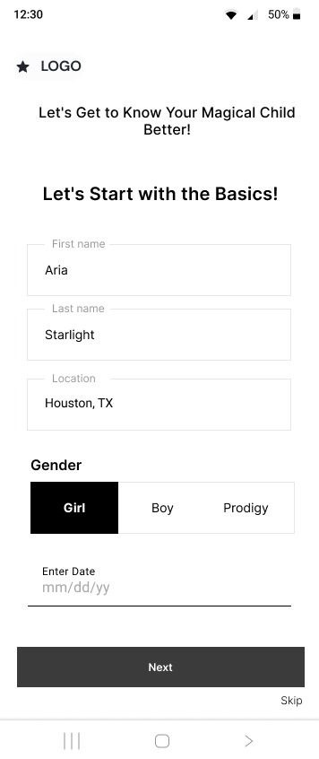
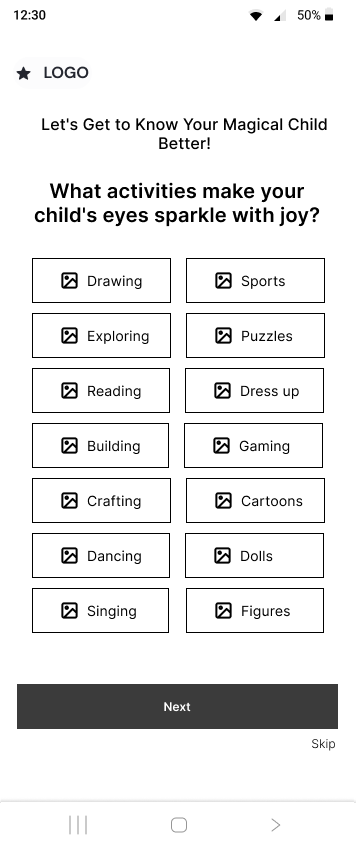
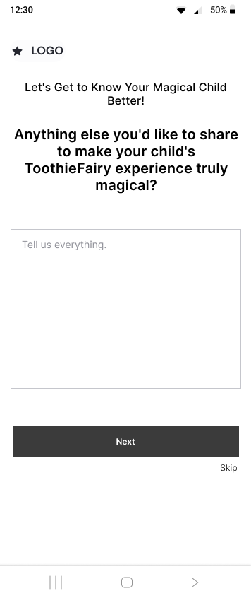
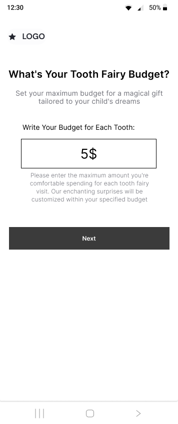
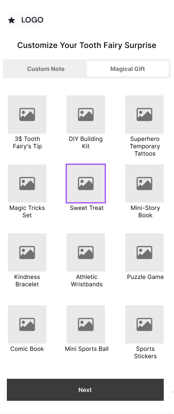
The work process involved conducting a comprehensive questionnaire targeting parents to gather insights into their experiences and expectations surrounding tooth loss traditions. This data was then analyzed to create user personas, guiding the design decisions. The website's AI-driven system tailors the tooth fairy note, gifts, and waiting experience based on the child's preferences, character, and the parent's budget. The challenge was to strike a balance between personalization and user simplicity.
Findings 💡
Findings 💡
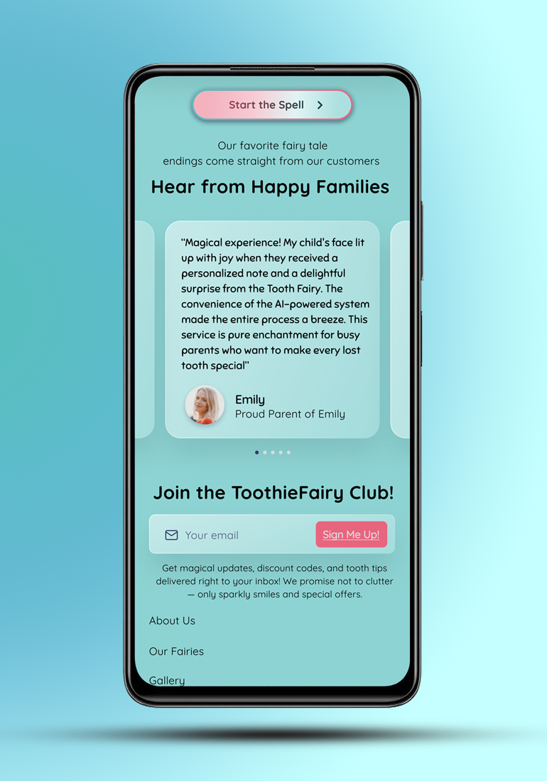
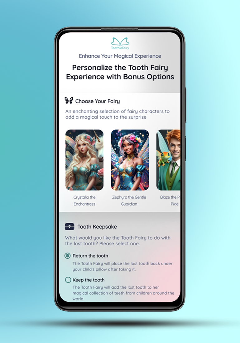
The findings highlighted the importance of streamlining the user experience. The questionnaire became a crucial tool for understanding the nuances of each child's personality and preferences. The design process navigated between providing creative freedom to users and ensuring the AI system handled most of the heavy lifting. The inclusion of optional extras, such as a special toothbrush and oral health brochure, added value to the service, catering to diverse parental needs.
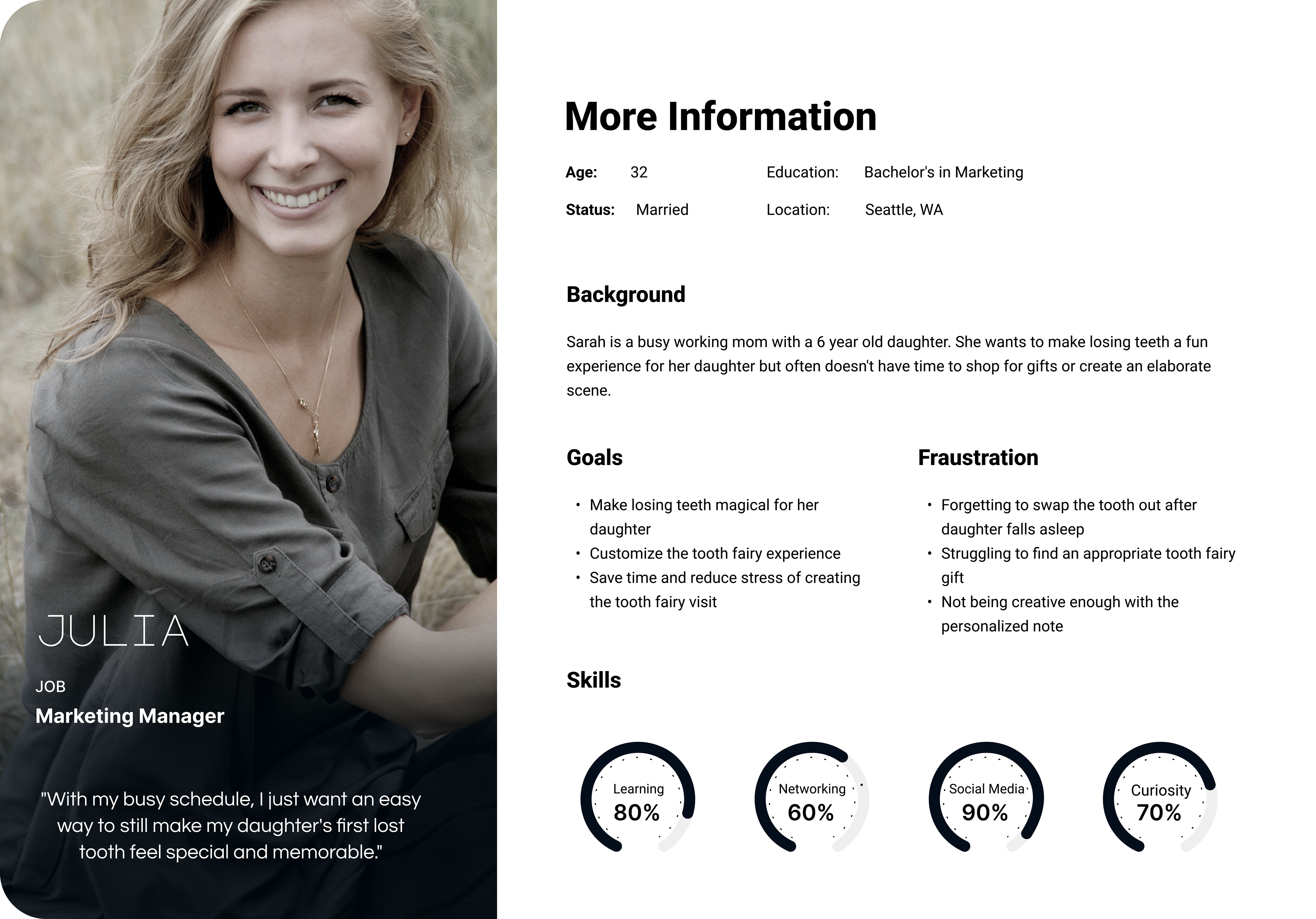
User Persona
In crafting the user personas for ToothieFairy, I embarked on a methodical journey, employing a structured questionnaire to glean insights from parents of children aged 6-10. This intentional approach allowed me to distill the varied perspectives and expectations within the target audience, ensuring that ToothieFairy's UX/UI design resonates with the nuanced needs of its users. The following personas encapsulate the diverse tapestry of parents' desires and concerns, serving as guiding beacons for an enchanting and user-centric design.
Julia - Busy working mom lacking time for elaborate tooth fairy moments
Michael - Loving but skeptical dad seeking tooth fairy involvement for daughter
Sarah - Tel Aviv dentist and single mom passionate about instilling oral health
Julia - Busy working mom lacking time for elaborate tooth fairy moments
Michael - Loving but skeptical dad seeking tooth fairy involvement for daughter
Sarah - Tel Aviv dentist and single mom passionate about instilling oral health

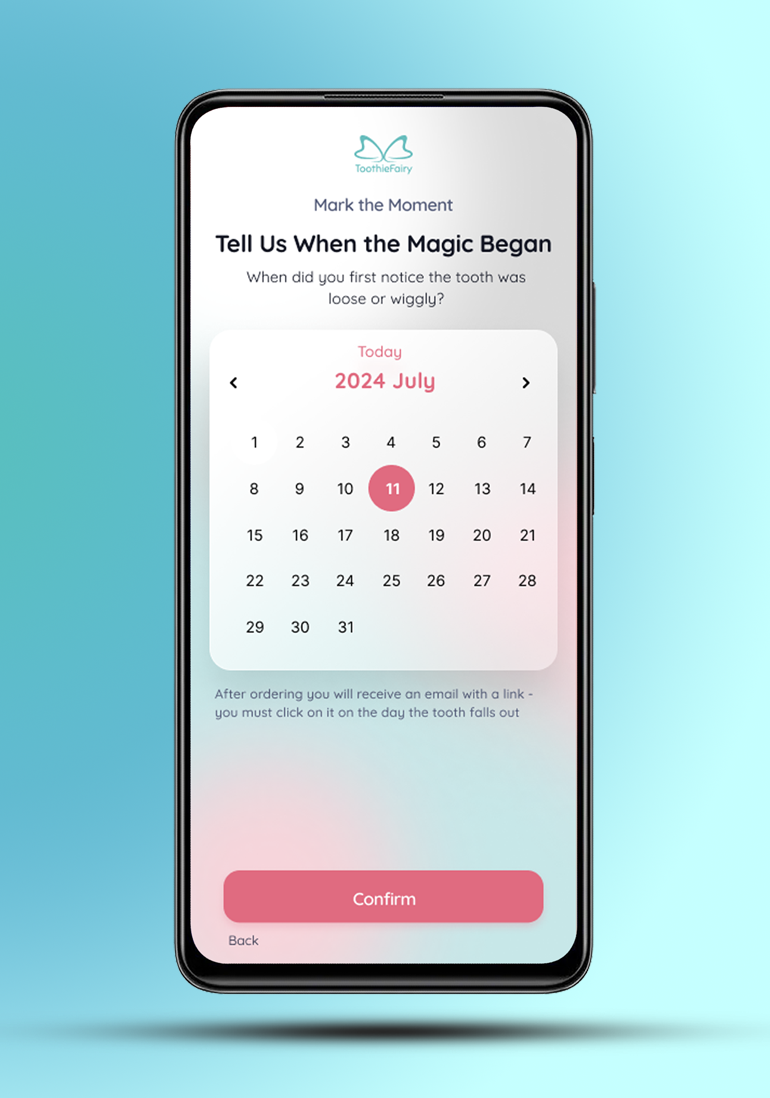
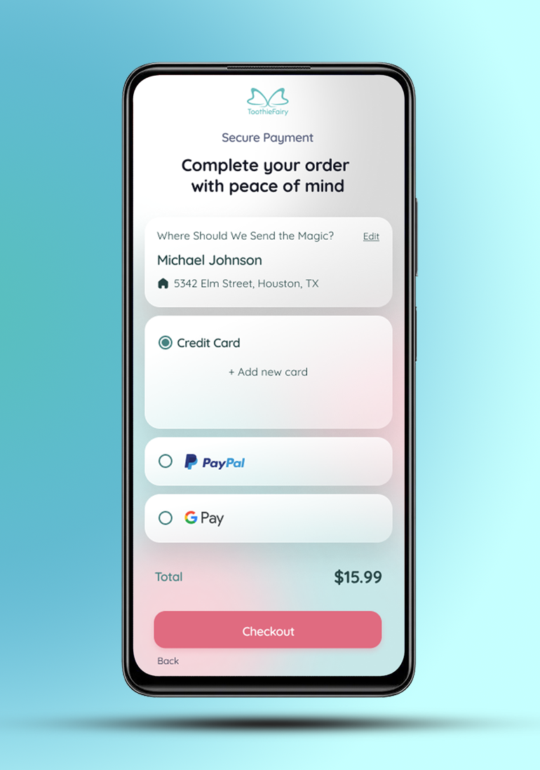
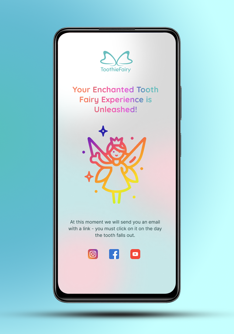
User Journey
Wireframes


Colors
The carefully chosen color palette for this tooth fairy service encapsulates a magical experience. The deep Midnight Blue serves as the brand's anchor, radiating reliability, while the vibrant Teal and Coral accents inject excitement and playfulness into key elements. Accompanied by the soothing Neutral Colors, the palette strikes a harmonious balance, creating a visually engaging and enchanting atmosphere for users

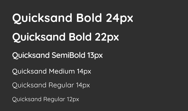
Typography
The carefully chosen color palette for this tooth fairy service encapsulates a magical experience. The deep Midnight Blue serves as the brand's anchor, radiating reliability, while the vibrant Teal and Coral accents inject excitement and playfulness into key elements. Accompanied