

Mailwatch – Dashboard UX/UI Design
Project type: Admin Dashboard UX/UI
Client: Mailwatch – Organizational email activity monitoring
Client: Mailwatch – Organizational email activity monitoring
The Challenge
The existing dashboard lacked visual design, hierarchy, or a consistent visual language. Users struggled to navigate the interface, and the system had no clear design direction or branding.
The Solution
Conducted UX research to understand real user needs and key functionalities.
Restructured data and key actions to improve information architecture.
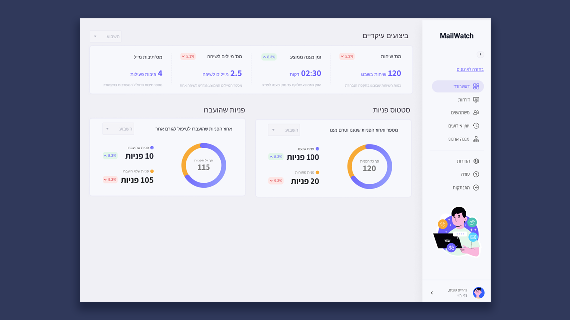
Designed a clean, user-friendly, and visually appealing interface tailored for daily use.
Developed a trendy, approachable color palette to reflect the product’s youthful energy—even in the absence of formal branding.
Added interactive elements like smart filtering, global search, and admin actions (import/export, permissions, delete).
The Result
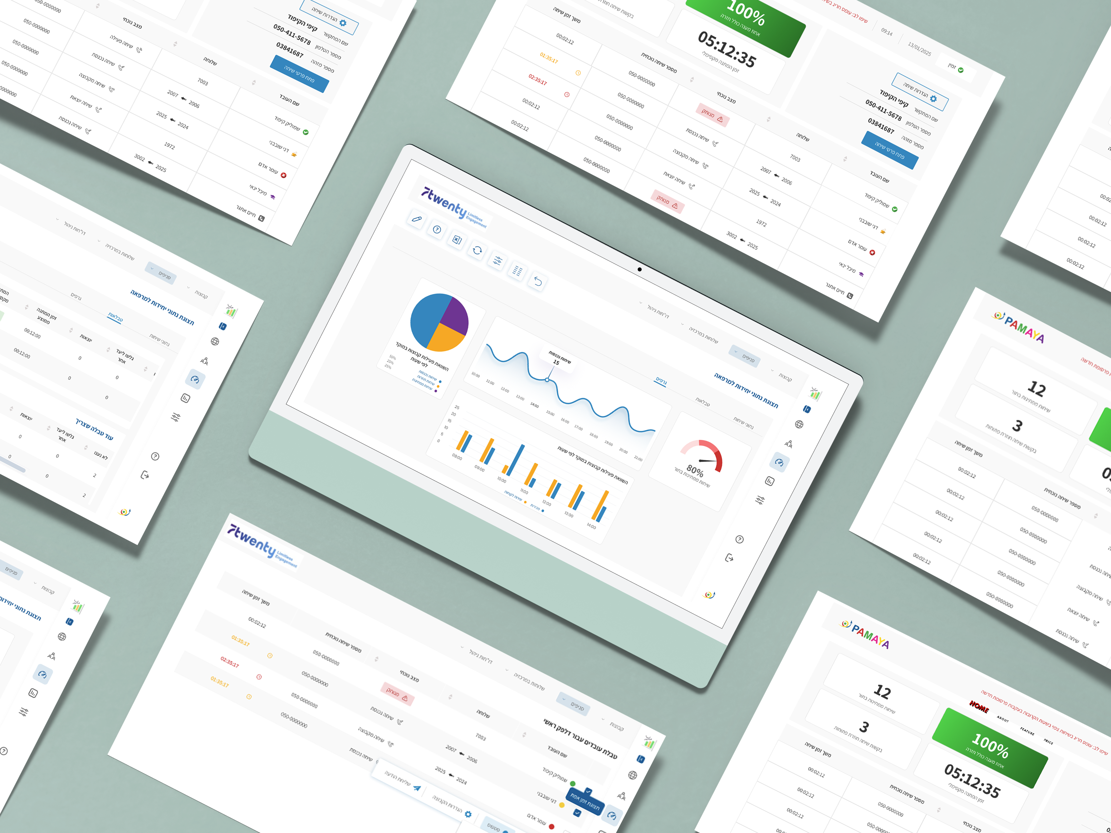
A modern, intuitive dashboard with a clean layout and fresh UI. The final product is easy to navigate and built around real user workflows, combining strong UX strategy with refined visual design.
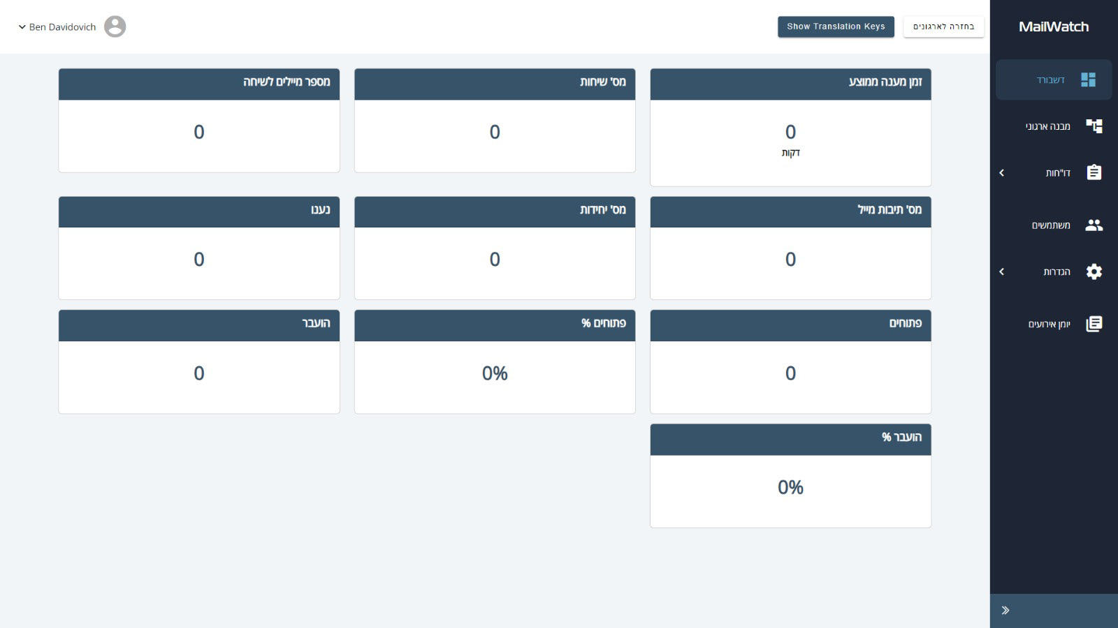
Before – Legacy Dashboard
The original dashboard was functional but lacked visual structure and user-friendly hierarchy. The UI felt outdated, and users struggled to quickly interpret the data or take action.
The original dashboard was functional but lacked visual structure and user-friendly hierarchy. The UI felt outdated, and users struggled to quickly interpret the data or take action.
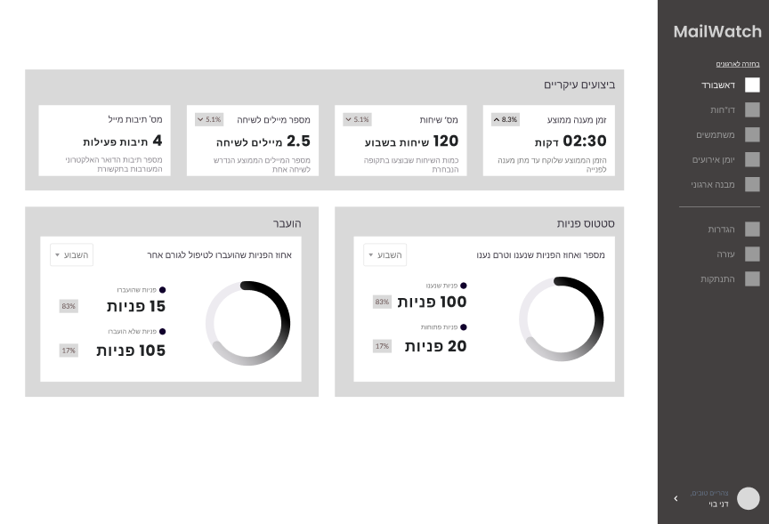
UX Stage – Wireframe & Structure
Before jumping into visual design, I created a high-fidelity wireframe based on user needs and system goals. This helped validate content hierarchy, interaction flows, and overall usability before adding visual polish.
Before jumping into visual design, I created a high-fidelity wireframe based on user needs and system goals. This helped validate content hierarchy, interaction flows, and overall usability before adding visual polish.
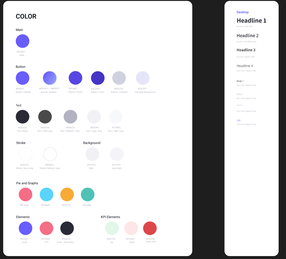
Design System & Style Guide
As part of the UI process, I developed a design system that includes a consistent color palette, typography hierarchy, button states, and data visual elements. This ensures scalability, clarity, and a cohesive product experience.
As part of the UI process, I developed a design system that includes a consistent color palette, typography hierarchy, button states, and data visual elements. This ensures scalability, clarity, and a cohesive product experience.