Neta – Brand Refinement & Visual Identity
Logo • Visual Language • Print Applications
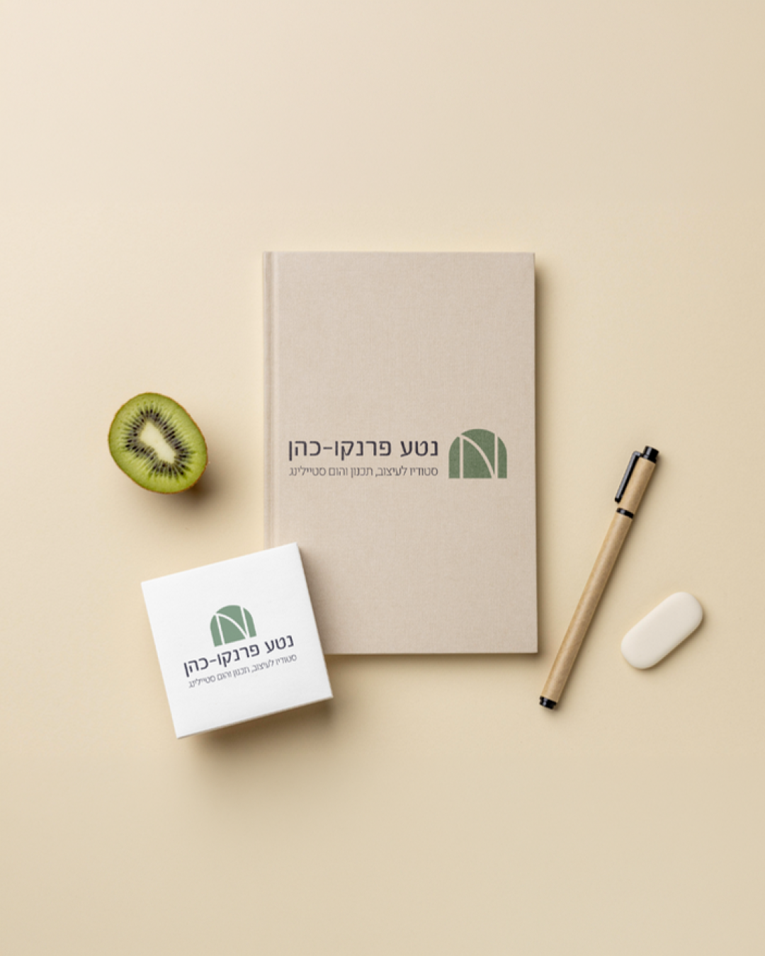
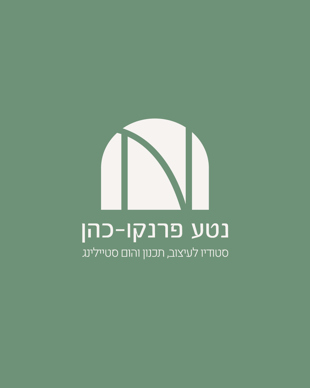
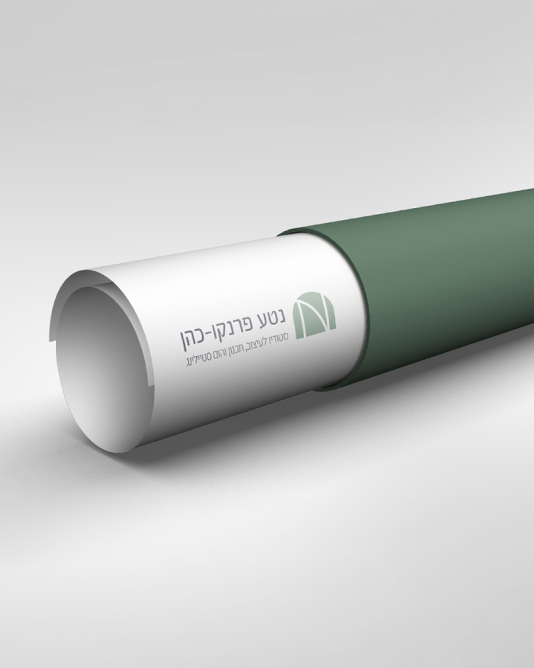
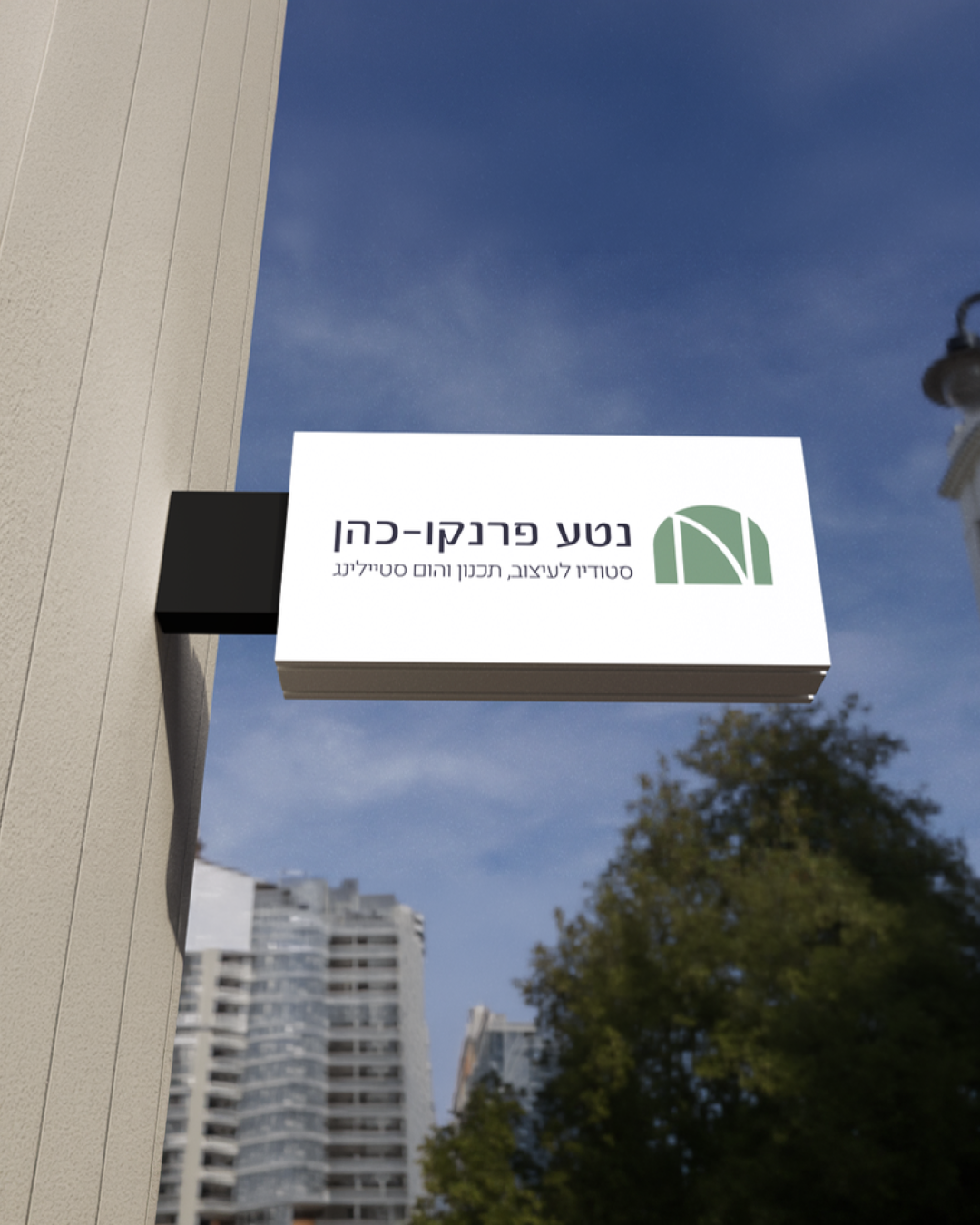
Neta came into the process with a strong visual taste and an existing direction.
The goal was not to reinvent, but to refine and elevate the brand to match her growth.
The goal was not to reinvent, but to refine and elevate the brand to match her growth.
We focused on simplifying and sharpening the visual language - defining her audience, clarifying the message, and translating it into a clean and mature identity.
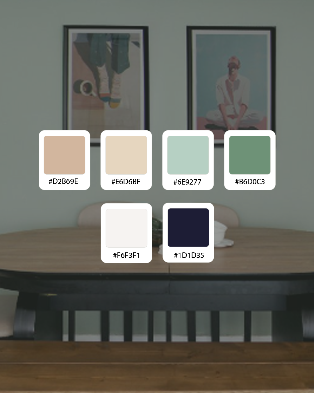
The final logo is typographic, built with soft, natural lines, supported by a balanced color palette and flexible brand applications.
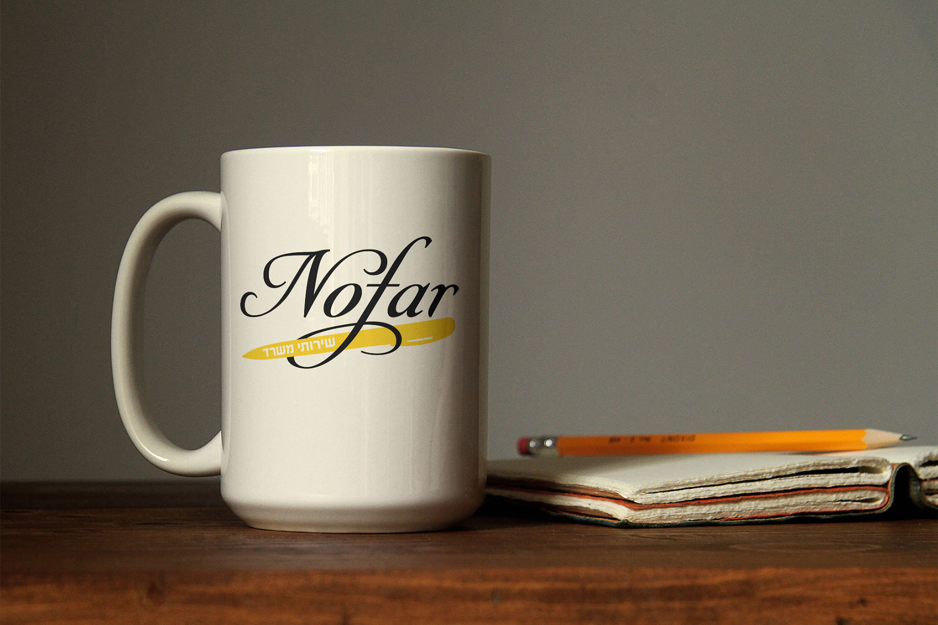
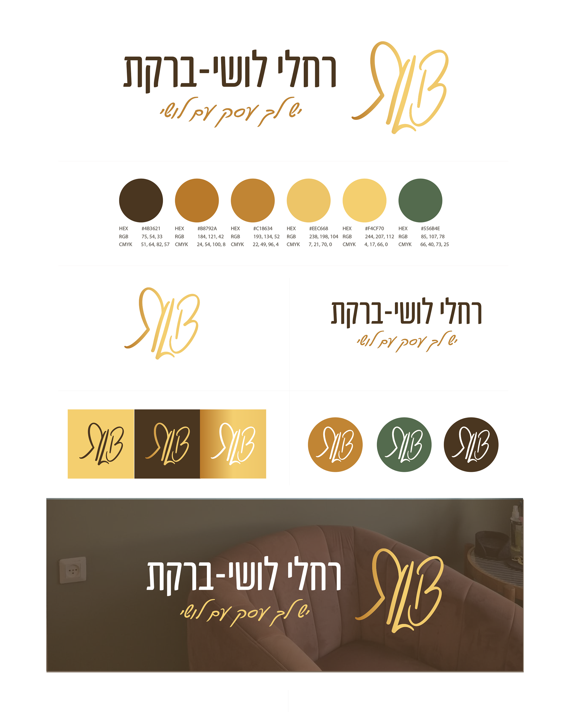
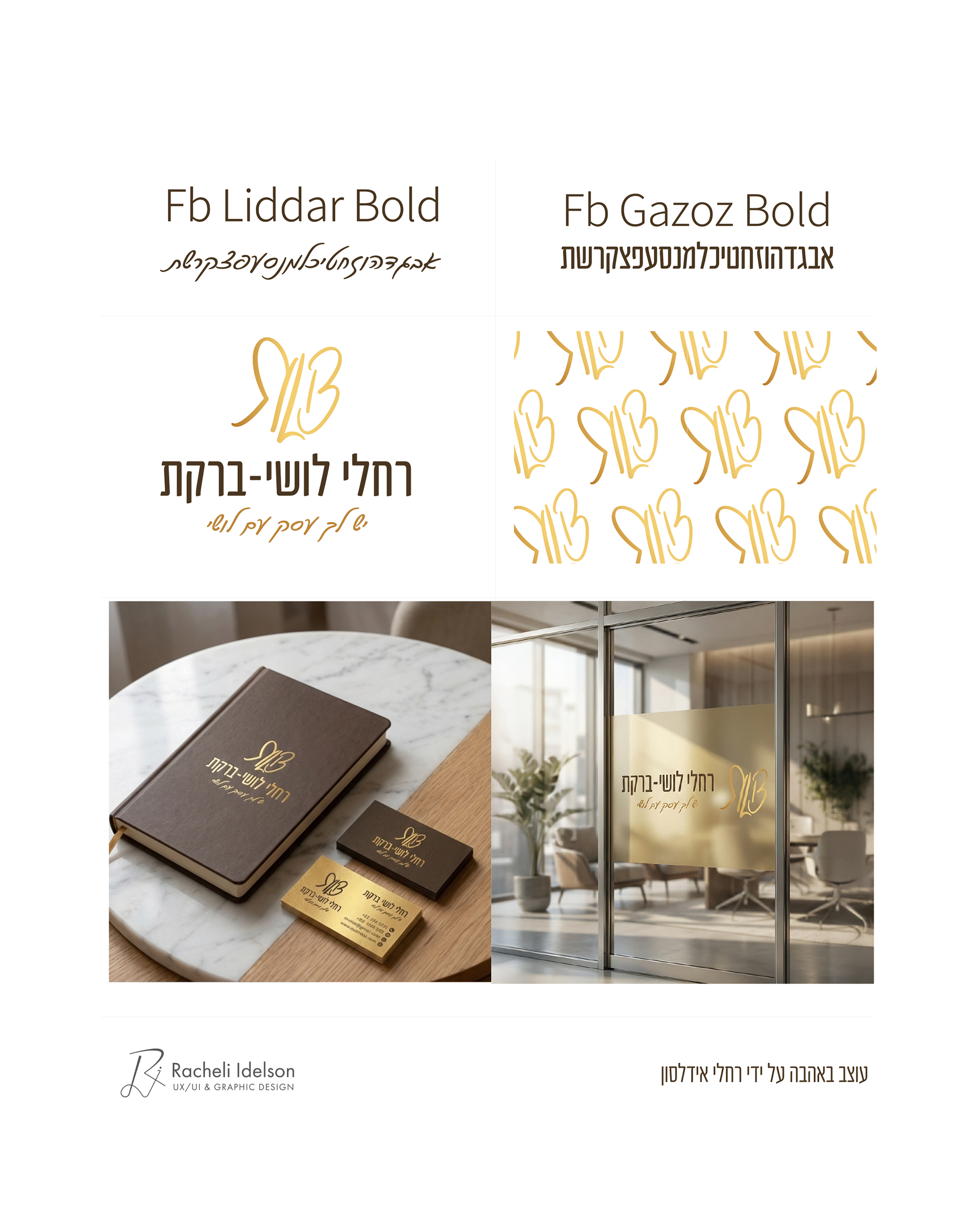
Racheli Lushi-Barkat - Logo Refresh for a Strategic Business Consultant
A refined logo evolution for Racheli Lushi-Barkat, a business consultant known for her ability to connect people, ideas, and strategy.
The goal was not to reinvent the brand, but to elevate and sharpen it.
Racheli loved her existing logo, yet felt it no longer fully represented who she is today.
Racheli loved her existing logo, yet felt it no longer fully represented who she is today.
The process focused on preserving key brand assets-such as the gold tone and the concept of connection-while refining the typography, proportions, and hierarchy to create a more confident and contemporary presence.
The result is a logo that maintains familiarity while projecting growth, clarity, and strategic authority.
A refresh that respects the past—while standing firmly in the present.
A refresh that respects the past—while standing firmly in the present.

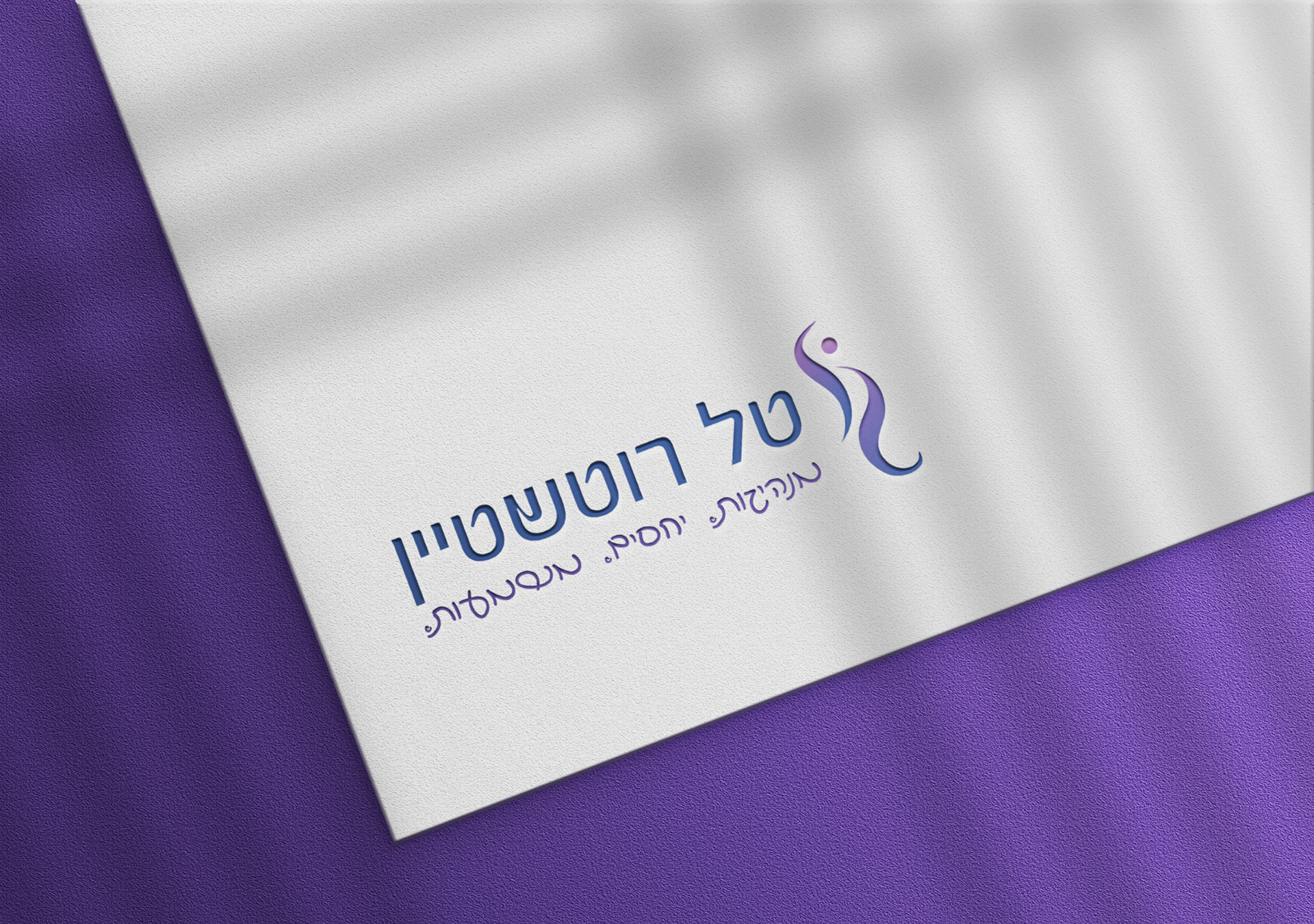
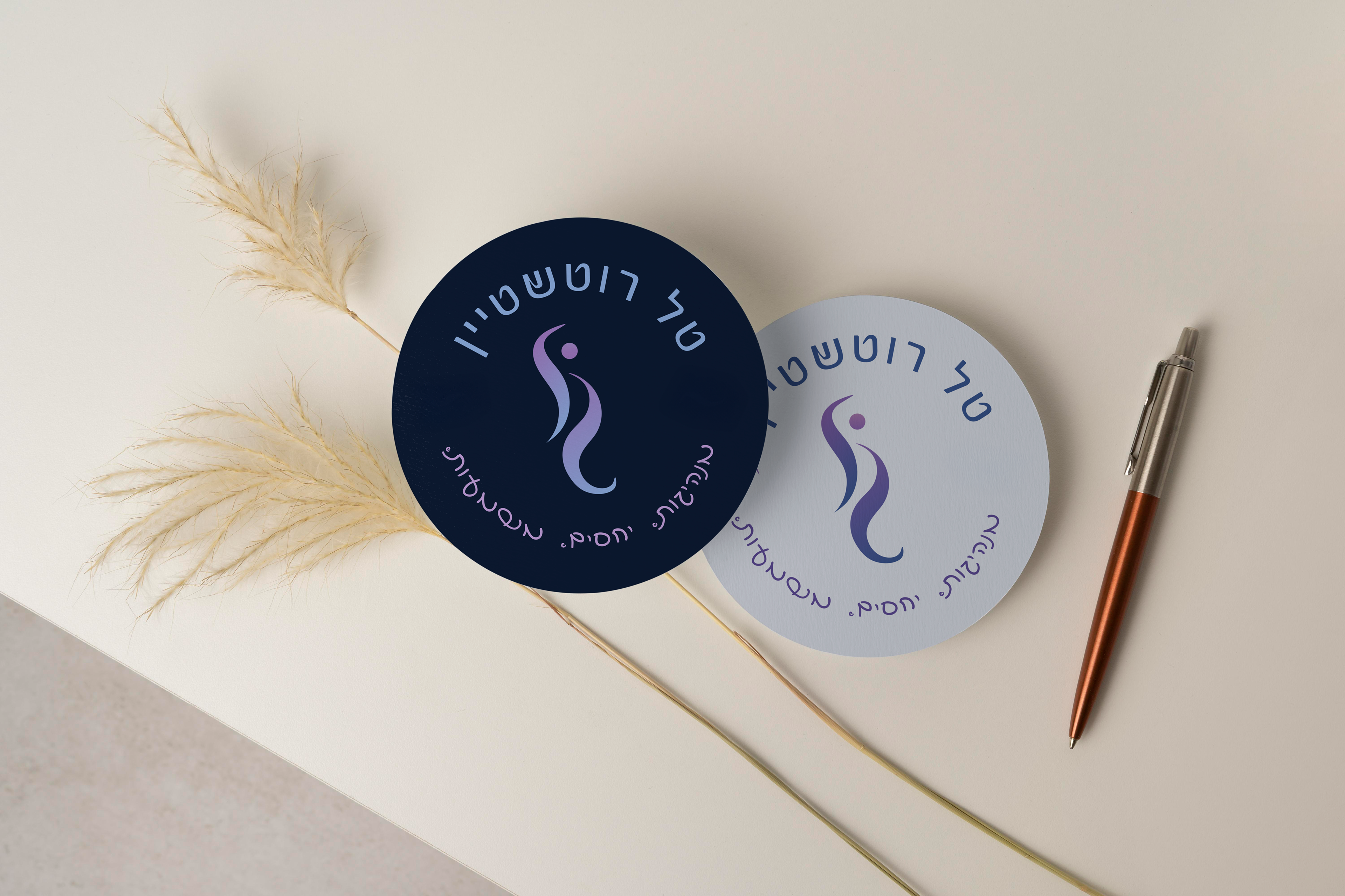
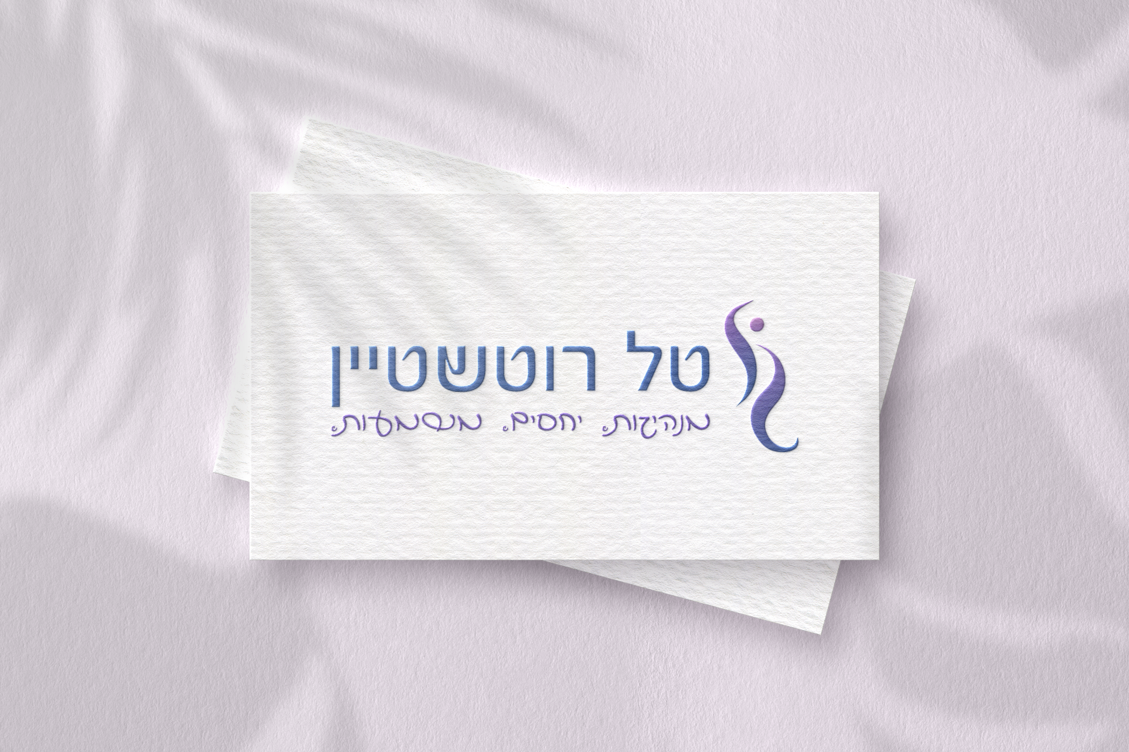
Tal Rotshtein – Visual Identity for a Journey of Leadership, Growth, and Meaning
Creating a heartfelt and symbolic brand identity for Tal Rotshtein, a lecturer and group facilitator who guides people through processes of leadership, relationships, and personal growth. Following the events of October 7th, Tal chose to embark on a new career path to make a real difference in people’s lives.
The logo features two flowing, curved lines forming a path that symbolizes guidance, growth, and human connection. Above them is a circle that can be seen as a sun, a head, or a shared destination, evoking flow and water—a key value Tal wanted to express in her brand.
From the start, Tal knew she wanted a handwritten-style typeface. However, none of the fonts felt right for her identity—until I suggested using a typeface created from the handwriting of Noa Zender, who was murdered at the Nova festival. After reading about Noa’s story, Tal felt deeply moved and connected, and together we decided that this choice would both honor Noa’s memory and reflect Tal’s own life-changing decision after October 7th.
The final visual identity combines fluidity and strength, presence and warmth, resulting in a logo that tells Tal’s story of leadership, growth, and humanity.
Biblical Hebrew with Or Liber - Visual Identity for a Modern Approach to Ancient Language
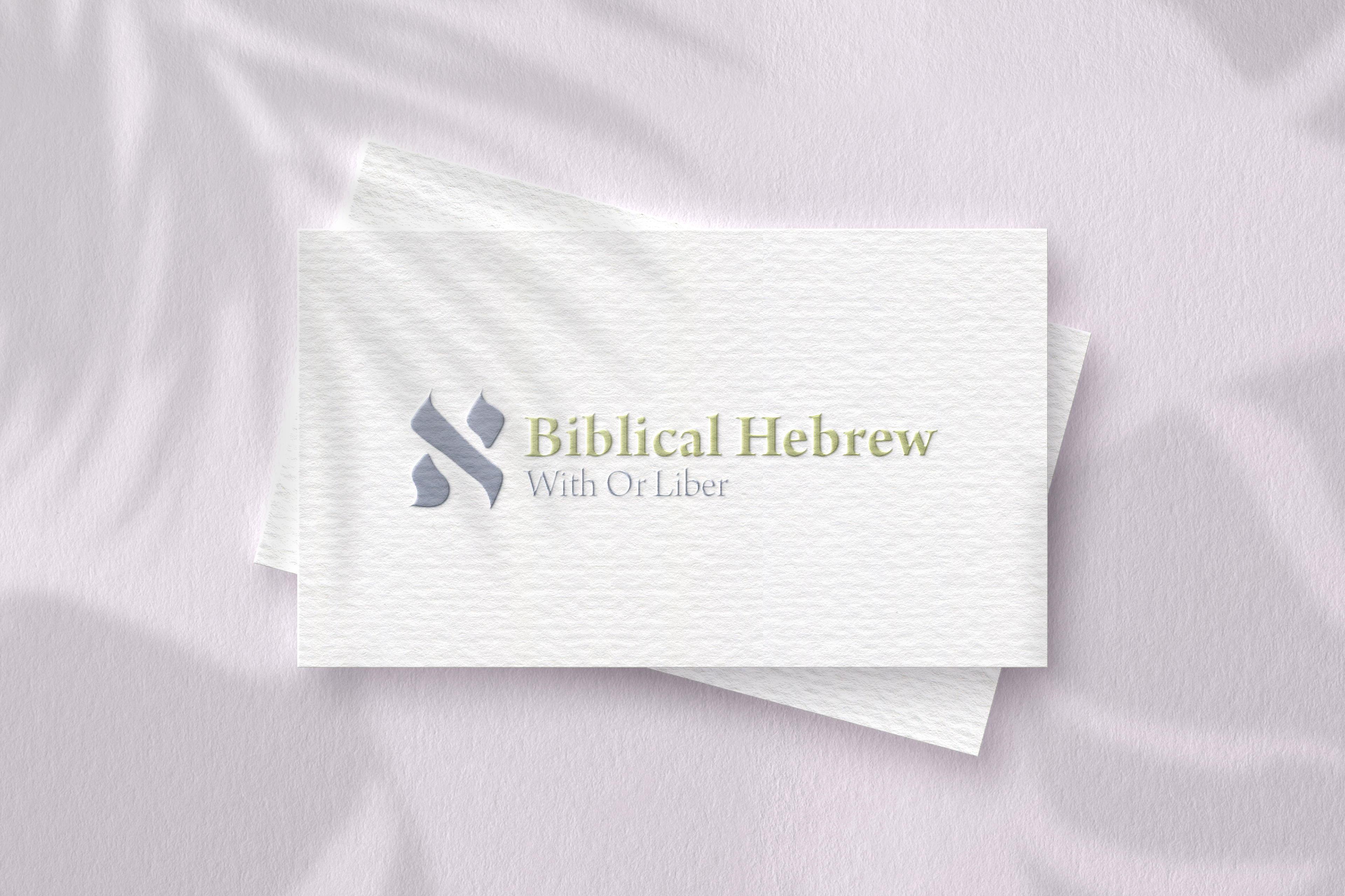
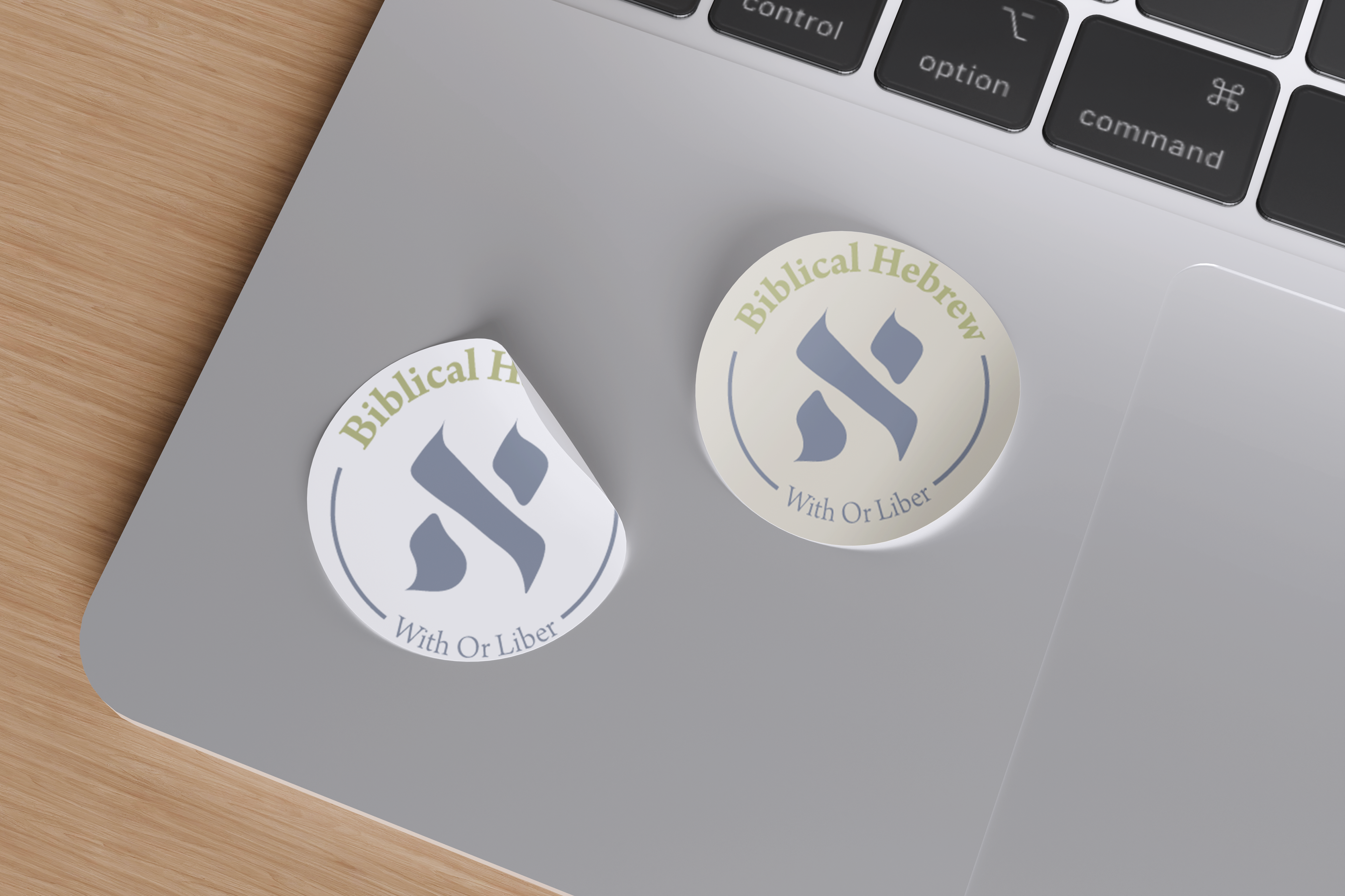
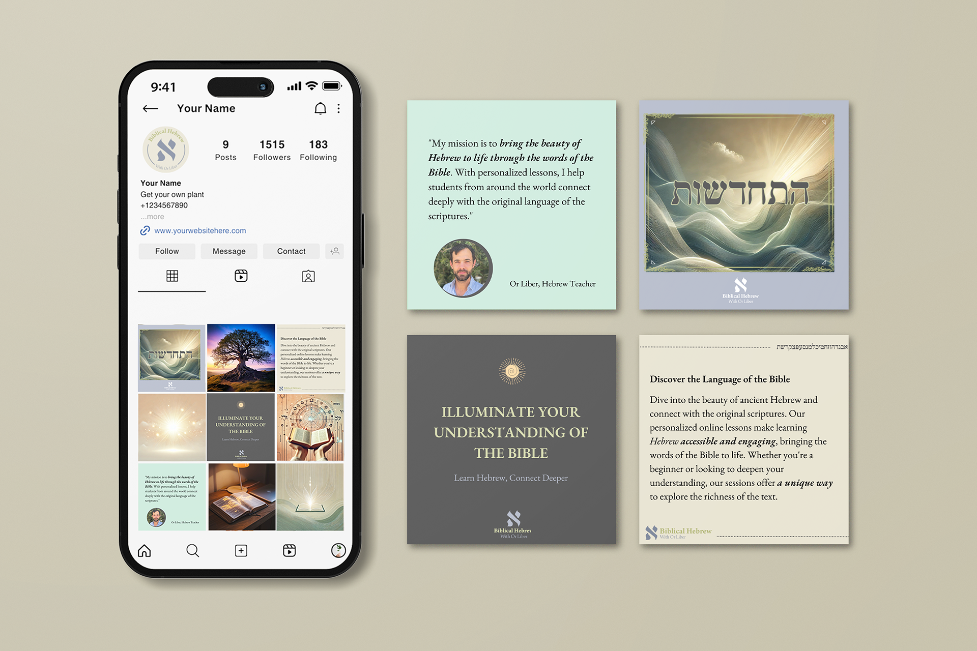
Creating a meaningful brand identity for Or Liber, a passionate Biblical Hebrew teacher who teaches students worldwide via Zoom. The logo centers on the Hebrew letter Aleph- the first letter of Or’s name and the first letter of the Hebrew alphabet, symbolizing beginnings, learning, and light.
The design combines tradition and modernity, with a stylized Aleph that appears illuminated and dynamic, representing discovery and enlightenment. Alongside the logo, I developed a harmonious color palette and versatile brand elements for social media, ensuring a cohesive and approachable look across all platforms.
La Mexicana - Authentic Mexican Restaurant
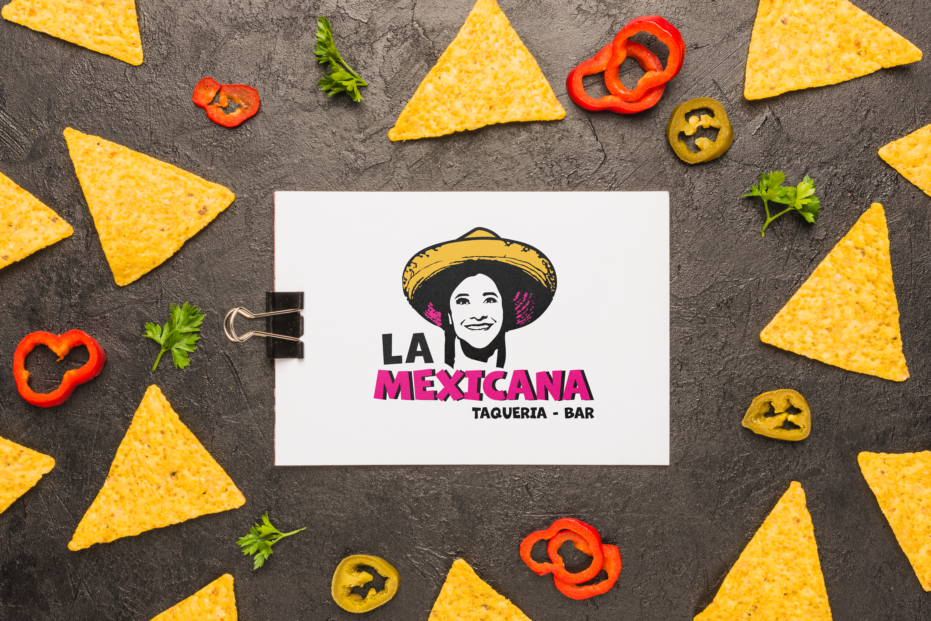
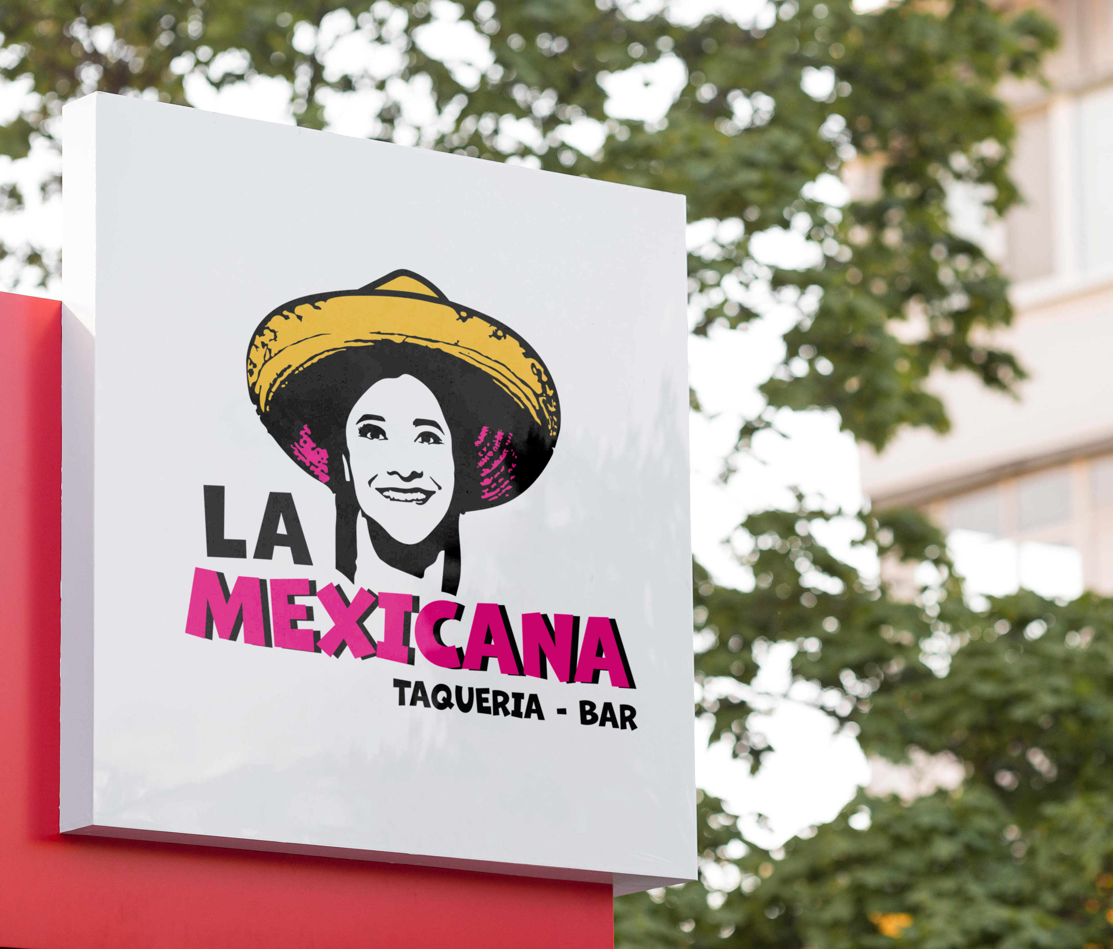
Sonia, the vibrant owner of La Mexicana, an authentic Mexican restaurant opening soon in Karlsruhe, Germany, required a visual identity that would reflect the warmth and authenticity of Mexican cuisine. I crafted an illustrative logo that combines Sonia's joyful personality with traditional Mexican elements.
I designed a smiling portrait illustration of Sonia wearing a traditional Mexican hat, with the restaurant's name displayed underneath. The simple yet vibrant style captures the spirit of the establishment and Sonia's charming persona.
Key elements I focused on:
Simplicity and authenticity
Sense of joy and Mexican culture
Blend of tradition and modernity
Evokes Sonia's warm personality
Sense of joy and Mexican culture
Blend of tradition and modernity
Evokes Sonia's warm personality
The final result embodies everything Sonia set out to achieve – an iconic symbol representing authentic Mexican cuisine rooted in personal relationships and a vibrant culinary experience. Despite our virtual collaboration, Sonia's warmth and love for Mexican culture shone through, inspiring this fun and inviting design.
I'm eagerly anticipating La Mexicana's grand opening in Germany, where this logo will serve as a welcoming beacon for those seeking genuine Mexican flavors. The design not only represents the restaurant but also translates Sonia's bubbly personality into a visual feast, setting the stage for the culinary delights that await within.
I'm eagerly anticipating La Mexicana's grand opening in Germany, where this logo will serve as a welcoming beacon for those seeking genuine Mexican flavors. The design not only represents the restaurant but also translates Sonia's bubbly personality into a visual feast, setting the stage for the culinary delights that await within.


MEI Studio - Architecture & Interior Design
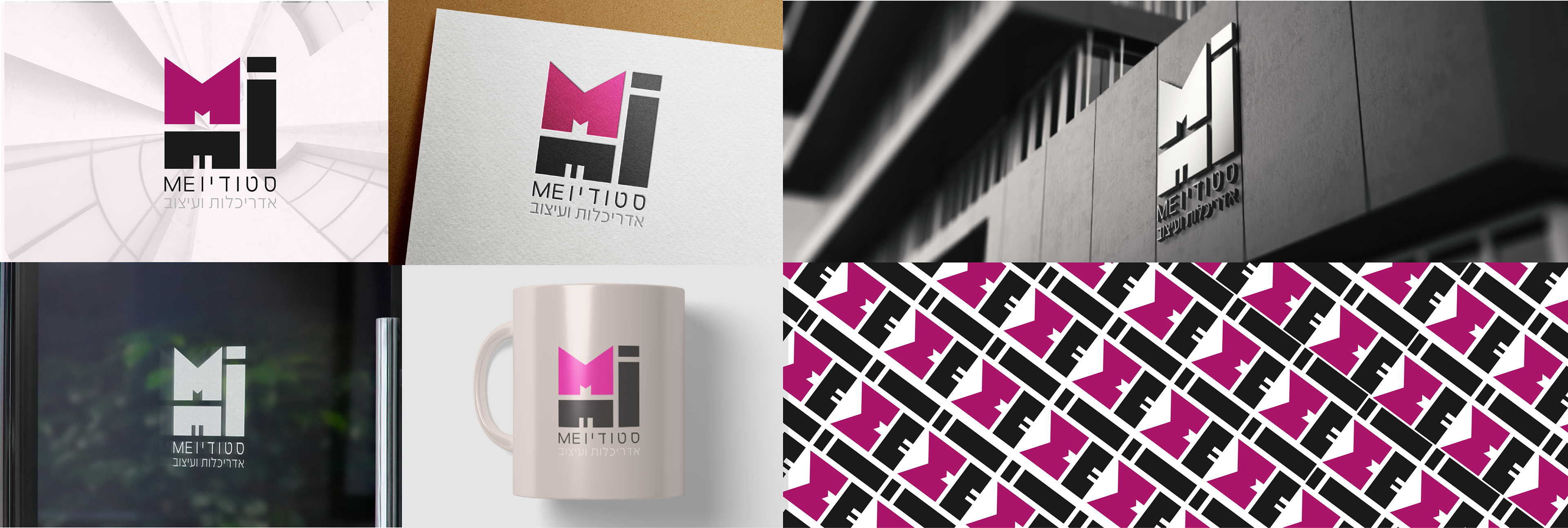
Architect and interior designer Mitall Yogev Kaufman required a sleek identity for her recently established high-end design studio. I crafted a minimal logo using her initials as an abstract building, mixing masculine squares with feminine magenta for an elevated yet playful signature style. The strong B&W backbone allows the accent to shine - much like Mitall’s sparkling personality which brightens up every space she enters. I loved partnering with Mitall on distilling her unique brand vision into one polished, geometric stamp.
Key elements I aimed for:
Clean and elegant
Sense of architecture
Sophisticated with a creative twist
Evokes her chic and warm spirit
The result embodies everything Mitall set out to achieve – an iconic mark representing superior architecture and design rooted in personal relationships and open creativity. I cannot wait to see "MEI Studio" reimagine many gorgeous spaces worldwide.
Sense of architecture
Sophisticated with a creative twist
Evokes her chic and warm spirit
The result embodies everything Mitall set out to achieve – an iconic mark representing superior architecture and design rooted in personal relationships and open creativity. I cannot wait to see "MEI Studio" reimagine many gorgeous spaces worldwide.
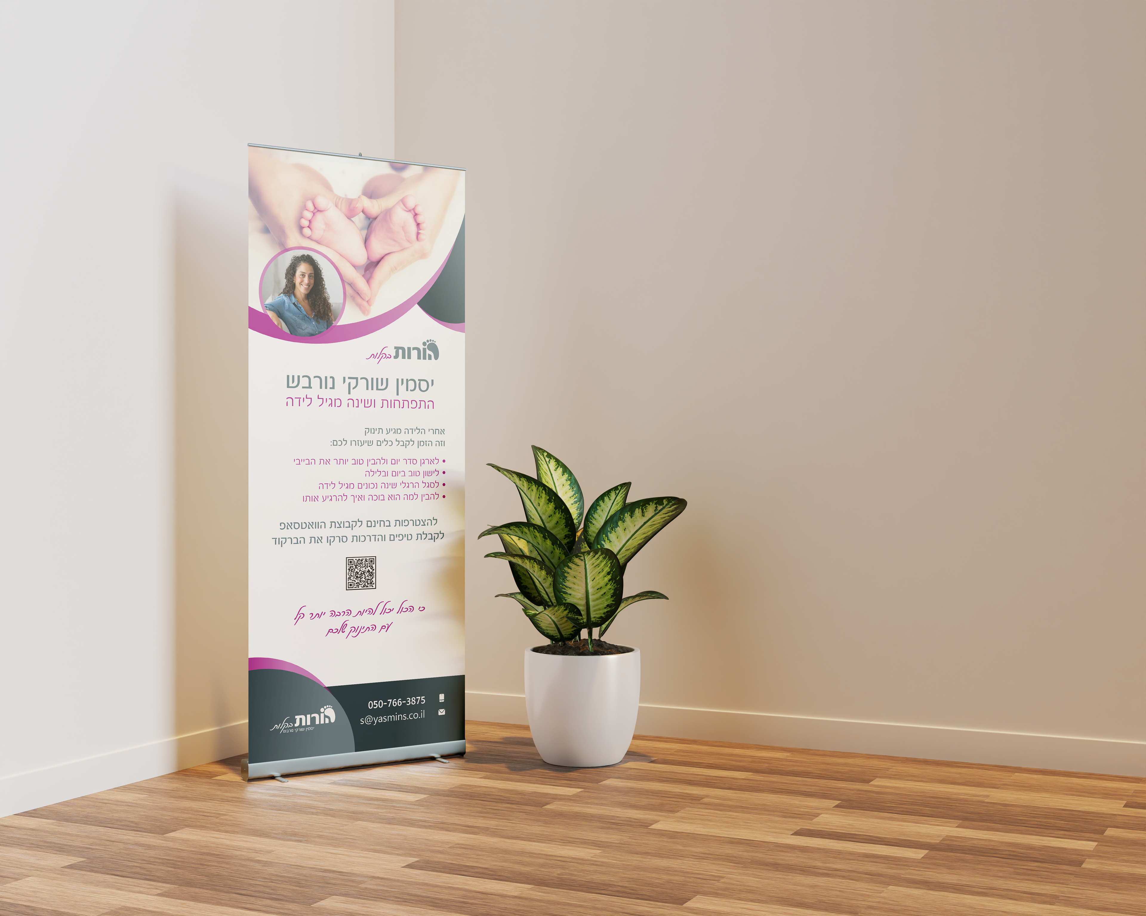
Baby guidance from parents
I have known Yasmin for years. She was my son's developmental companion.
When she asked to rebrand herself I was excited.
Yasmin wanted completely new branding - more mature that appeals to parents and shows seriousness.
From my acquaintance with her (something that spared me the long research) I knew she had a "thing" for baby feet. Because every time she started an activity with parents, she asked the babies to take off their socks and explain the importance of bare feet
When she asked to rebrand herself I was excited.
Yasmin wanted completely new branding - more mature that appeals to parents and shows seriousness.
From my acquaintance with her (something that spared me the long research) I knew she had a "thing" for baby feet. Because every time she started an activity with parents, she asked the babies to take off their socks and explain the importance of bare feet
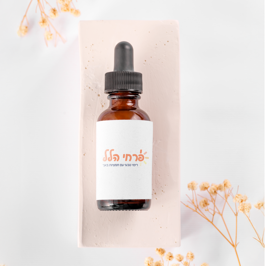
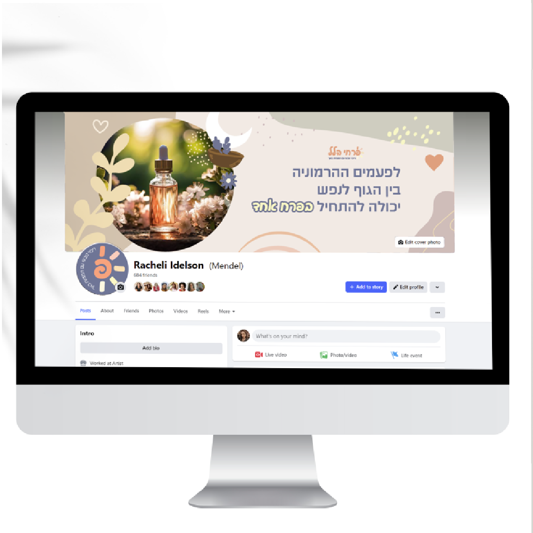
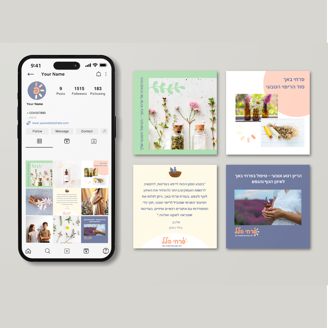
Pirchei Hallel – Branding for a Natural Therapy Practice
Logo • Visual Language • Print & Social Assets
When Hallel Yahalom approached me to create her new brand, she was at the very beginning of her journey as a certified Bach flower therapist.
We needed to craft something that felt soft, approachable, and family-friendly – but also professional and trustworthy.
The result: a cheerful and delicate logo, with colors and shapes that connect to nature, calm, and emotional healing.
The result: a cheerful and delicate logo, with colors and shapes that connect to nature, calm, and emotional healing.
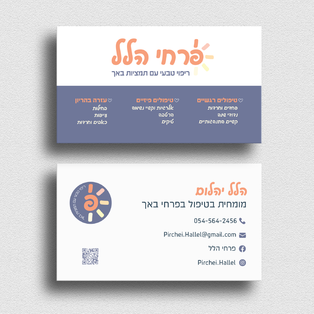
The branding suite includes:
Logo
Social media banners
Business cards
Visual elements for both print and digital


Jasmin Gallery – Luxurious Handcrafted Floral Experiences
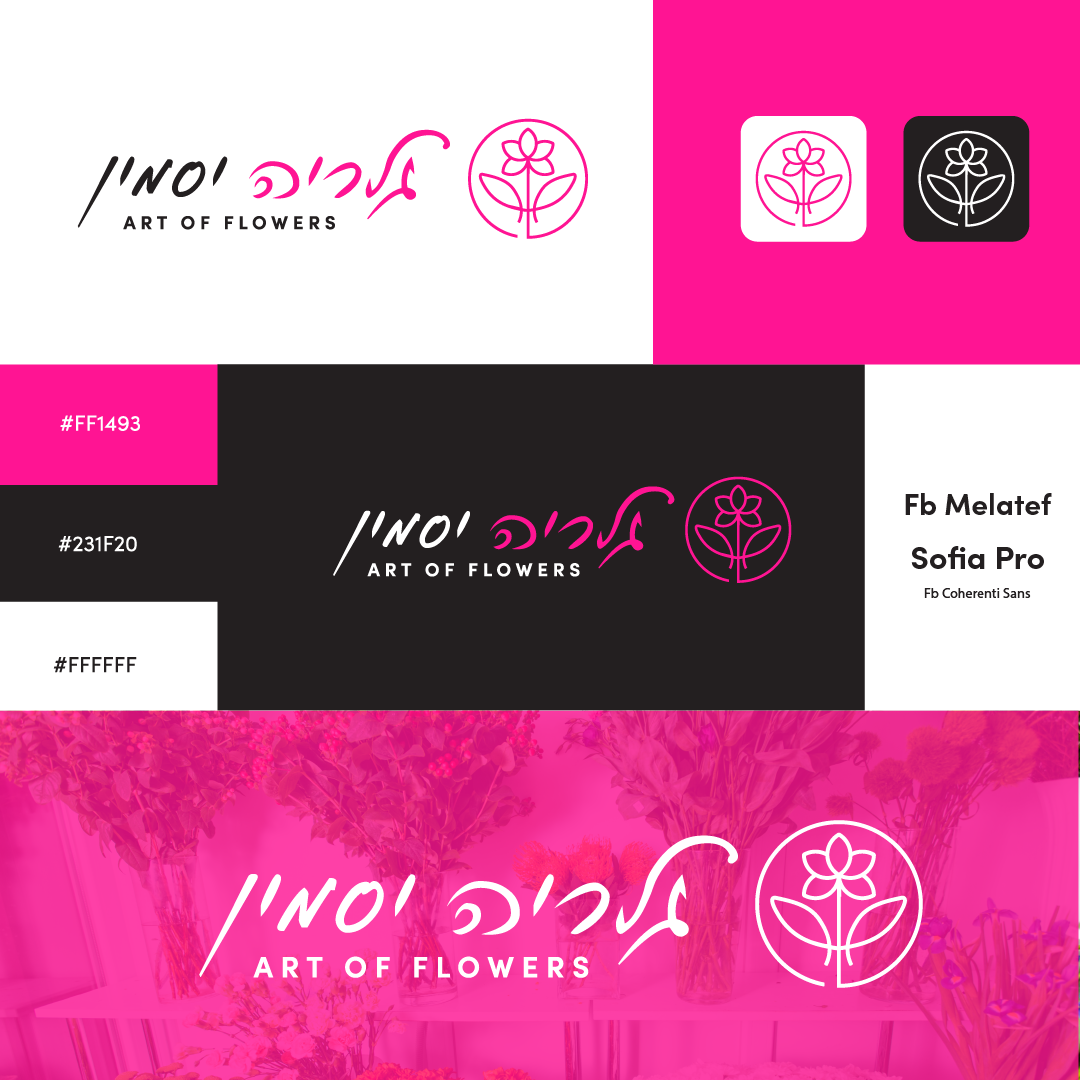
Jasmin Gallery, a flower, gift, and balloon shop located in the heart of Petah Tikva, sought a visual identity that would capture the elegance and warmth they offer to their customers. I created a unique and refined logo that embodies the shop’s values, reflecting the personal and welcoming service that Jasmin Gallery is known for.
The design combines elements from the floral and natural world with a modern touch, alongside the shop’s name displayed in elegant, soft lettering. The simple and clean style conveys both luxury and the heartfelt emotion that every arrangement or gift from Jasmin Gallery brings.
Key elements I focused on:
Elegance and softness with a refined touch
A sense of closeness and personal service
Connection between floral/nature themes and contemporary design
Evokes serenity alongside luxury and warmth
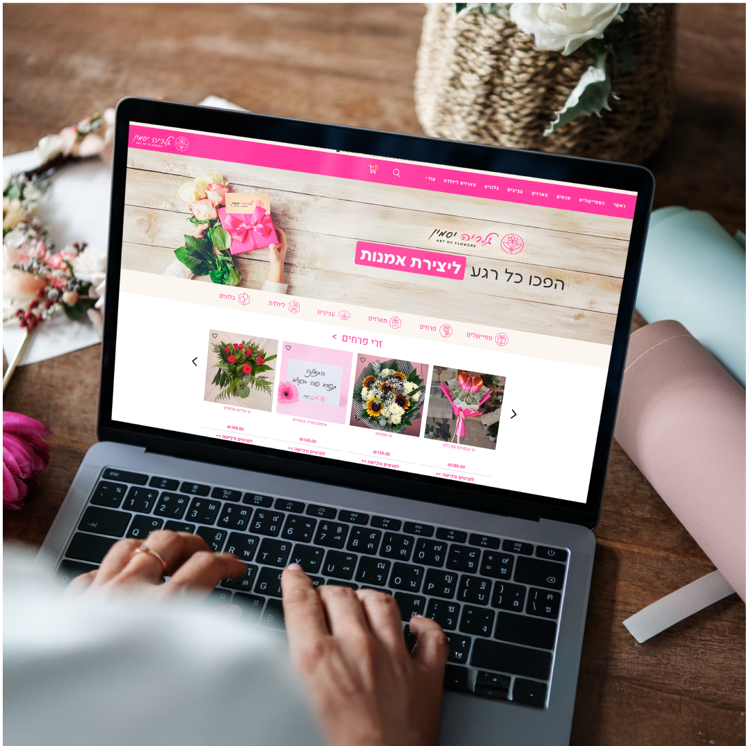
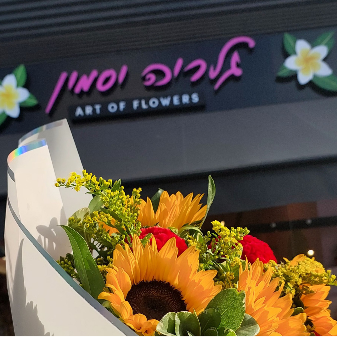
The final result perfectly represents what Jasmin Gallery strives to bring to its customers – an iconic symbol connecting the worlds of flowers, gifts, and personalized service. The branding reflects the enchanting atmosphere of the shop, offering a glimpse into the delightful experiences awaiting each customer who enters.
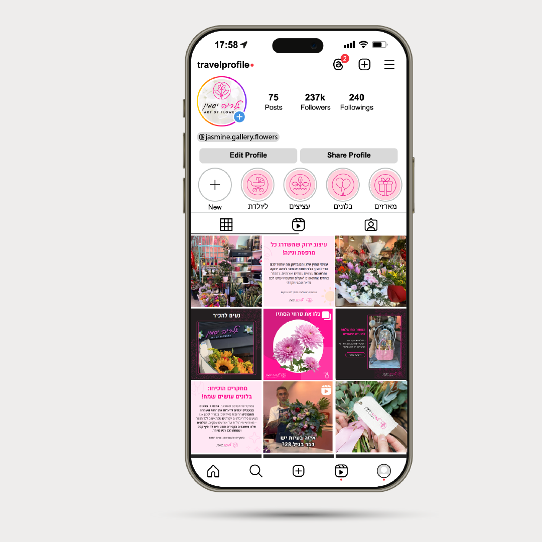
I’m thrilled to see how this logo serves as a unique bridge between Jasmin Gallery and its clients, inviting everyone to discover the shop’s special world of floral and gift design.

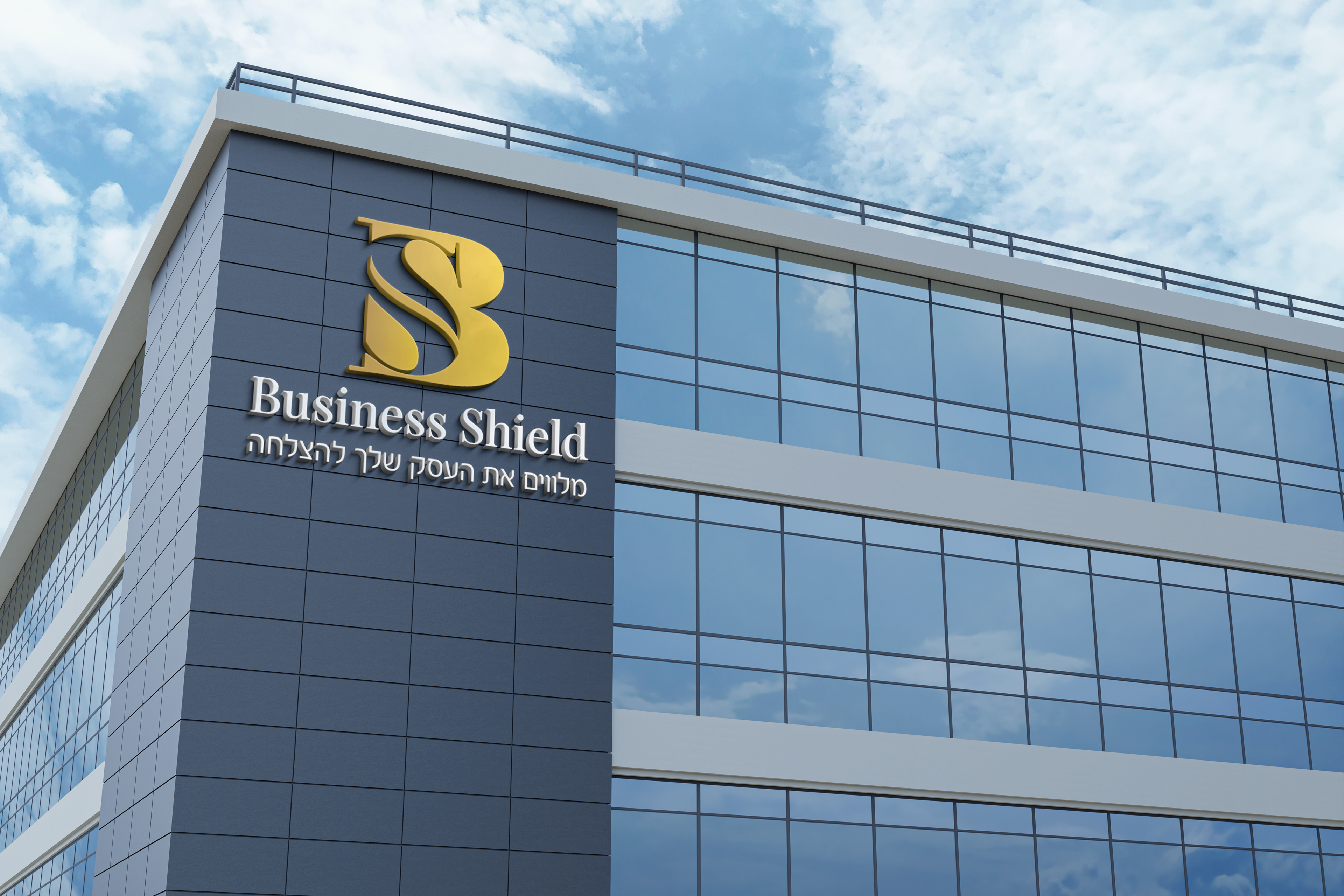
Business Shield
This is a company that mediates between businesses - the purchase of large or small businesses with personal support and extensive knowledge.
In the new branding, it was important to them that I take the inspiration from the previous logo - to keep the letters and the gold color.
In the new branding, it was important to them that I take the inspiration from the previous logo - to keep the letters and the gold color.


Dog grooming salon
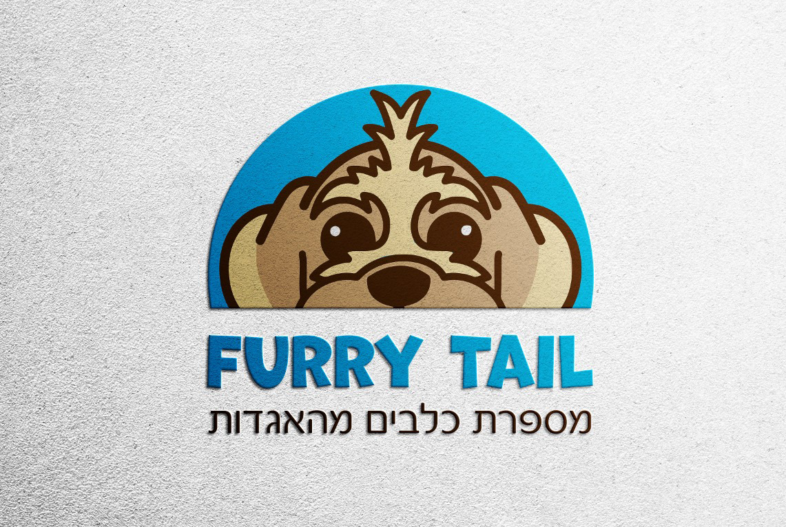
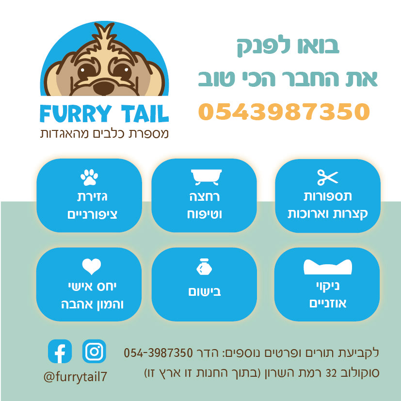
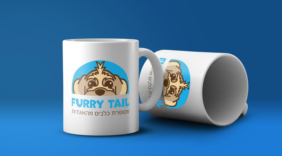
Hadar decided to embark on her own path and after years of employment, she opened a grooming salon.
With all the excitement came confusion.
Because she didn't know how to start at all.
We had a long conversation and after in-depth research,
I realized that her whole story began with her dog.
So without further thought, it was clear -
He must inspire the logo by his face
With all the excitement came confusion.
Because she didn't know how to start at all.
We had a long conversation and after in-depth research,
I realized that her whole story began with her dog.
So without further thought, it was clear -
He must inspire the logo by his face


Music producer logo
Oren asked me to make him a logo that connects his name to the music.
After getting to know Oren, I realized he has a respectable record collection and it became a part of him.
After getting to know Oren, I realized he has a respectable record collection and it became a part of him.
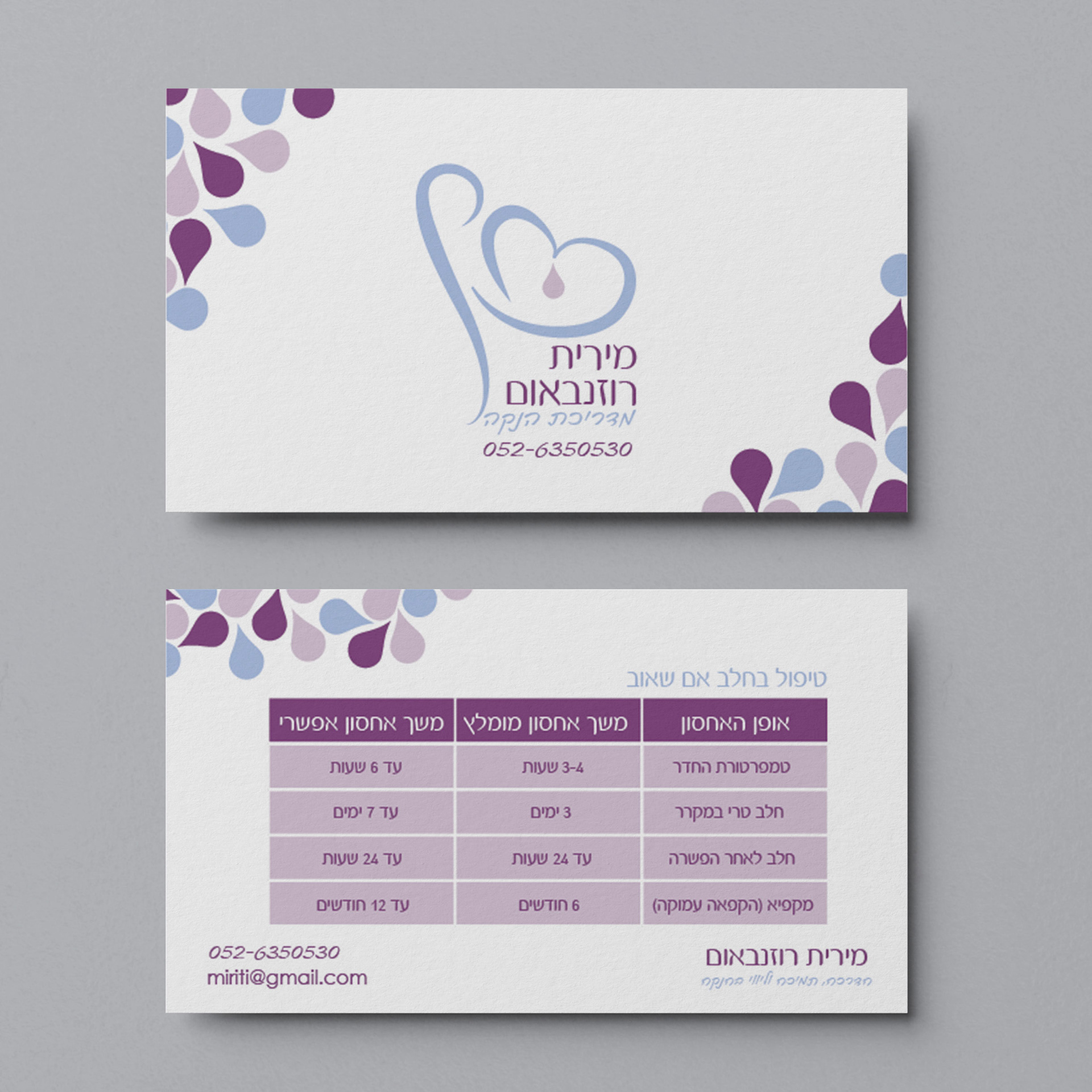
Logo and business card for breastfeeding Consultant
Mirit has long been looking for a logo that represented her differently from other breastfeeding consultants in the field.
She said that her uniqueness is that she is a breastfeeding instructor even during pregnancy.
It was important to me to combine her name in Hebrew with her love for the breastfeeding and pregnancy profession.
She said that her uniqueness is that she is a breastfeeding instructor even during pregnancy.
It was important to me to combine her name in Hebrew with her love for the breastfeeding and pregnancy profession.
On the business card, I suggested that she make a table of instructions on how to store breast milk on one side, because after researching and examining the issue, it turns out that a lot of breastfeeding women get involved with the issue.

Logo for a settlement Yushuv Bedaat - mortgage advice
When Roi approached me he was confident in what he wanted the logo to be and what it would convey- he wanted there to be a house icon and shades of blue.
It was very important to Roi to convey his credibility to his audience in the ultra-Orthodox community where he lives, but at the same time not be too serious because the mortgage world often sounds like a very heavy and tough issue.
It was very important to Roi to convey his credibility to his audience in the ultra-Orthodox community where he lives, but at the same time not be too serious because the mortgage world often sounds like a very heavy and tough issue.