

Conchi
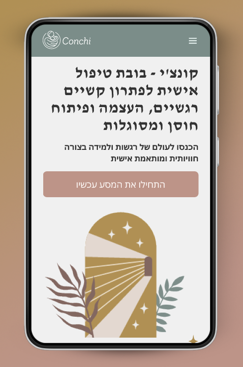
Conchi is an innovative UX/UI design for a platform that combines AI technology with a smart doll to provide personalized emotional support for children and guidance for parents. Through an interactive website and a connected smart toy, Conchi aims to make addressing children's emotional needs more accessible, effective, and engaging for young families.
Conchi is an innovative UX/UI design for a platform that combines AI technology with a smart doll to provide personalized emotional support for children and guidance for parents. Through an interactive website and a connected smart toy, Conchi aims to make addressing children's emotional needs more accessible, effective, and engaging for young families.
The Challenge 🎯
Although an imaginary concept, I approached this project focusing on real parent and child needs around losing teeth. Research shows many young parents struggle to find time and resources to address their children's emotional needs effectively. Our research showed that traditional solutions like child psychologists or parenting coaches are often expensive and have limited availability. This led to an opportunity for an AI-driven solution that provides constant, personalized support at an affordable price. An additional challenge was incorporating the vast amount of psychological and developmental data needed to create accurate, individualized profiles for each child while keeping the user interface simple and intuitive for parents.
ed that many parents struggle to balance busy lives with creating special tooth fairy moments. This led to an opportunity for a solution that magically handles the hard work for them.
ed that many parents struggle to balance busy lives with creating special tooth fairy moments. This led to an opportunity for a solution that magically handles the hard work for them.
Work Process 🔍
The work process involved extensive interviews with young parents and child psychology experts to understand the key emotional challenges faced by children and the obstacles parents encounter in addressing them. This data informed the creation of user personas and guided our design decisions.
Throughout the process, we underwent numerous iterations and updates to refine the system. A key focus was creating an interface that is extremely user-friendly, considering that not all parents are technologically savvy. We implemented a step-by-step approach in the system design to ease users through the process.
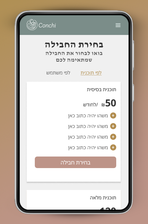
The website's AI system personalizes content and activities based on each child's unique emotional profile and the family's specific needs. The challenge was to create an interface that feels warm and personal while leveraging advanced technology, all while maintaining simplicity for users of varying tech abilities.
We continuously tested and adjusted the design to ensure that even parents with limited technological experience could navigate the system easily, while still providing the depth of personalization needed for effective emotional support.
Findings 💡
Throughout the process, we underwent numerous iterations and updates to refine the system. A key focus was creating an interface that is extremely user-friendly, considering that not all parents are technologically savvy. We implemented a step-by-step approach in the system design to ease users through the process.
The website's AI system personalizes content and activities based on each child's unique emotional profile and the family's specific needs. The challenge was to create an interface that feels warm and personal while leveraging advanced technology, all while maintaining simplicity for users of varying tech abilities.
We continuously tested and adjusted the design to ensure that even parents with limited technological experience could navigate the system easily, while still providing the depth of personalization needed for effective emotional support.
Findings 💡
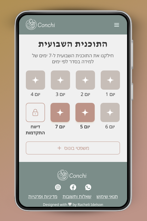
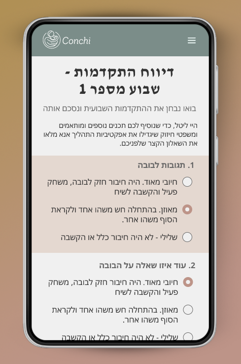
Our findings emphasized the importance of creating a user-friendly experience for both parents and children. The initial assessment questionnaire became a crucial tool for tailoring the AI's responses and the smart doll's interactions. The design process focused on balancing comprehensive emotional support with an intuitive, non-intimidating interface. Including features like real-time parenting tips and progress tracking added significant value, addressing the diverse needs of our target audience.
User Personas💡
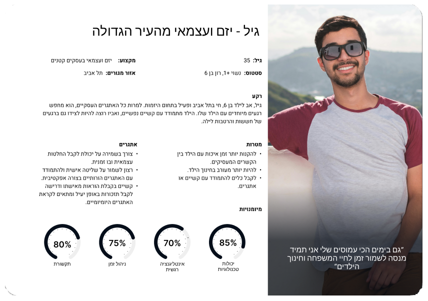
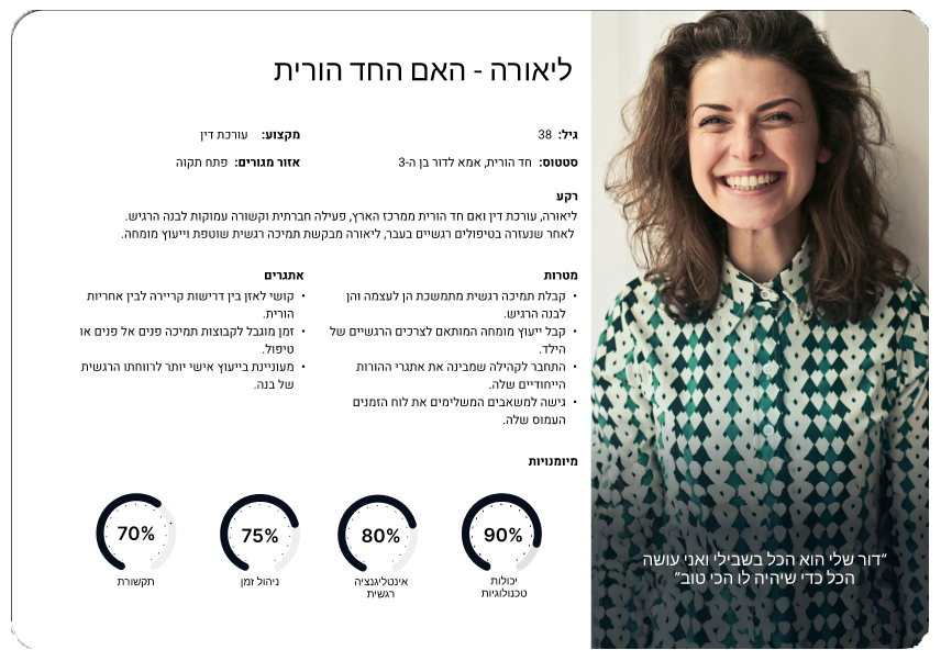
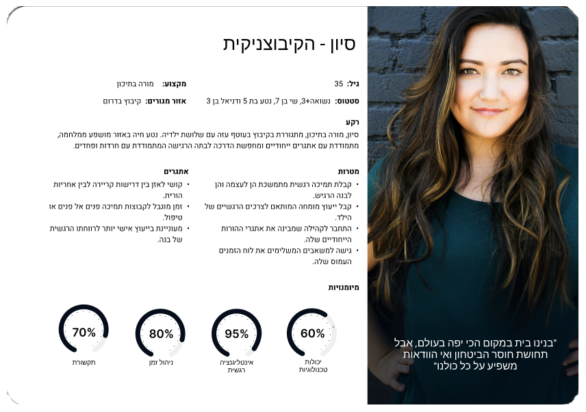
In crafting the user personas for Conchi, we employed a comprehensive approach, conducting in-depth interviews and surveys with parents of children aged 3-10 who face various emotional challenges. This methodical process allowed us to capture the diverse needs, expectations, and struggles within our target audience, ensuring that Conchi's UX/UI design addresses the complex realities of modern parenting. The following personas encapsulate the multifaceted nature of our users' experiences, serving as guiding principles for our empathetic and user-centric design.
Gil - Entrepreneurial father balancing business demands with a desire for quality parenting time and effective tools for his child's emotional needs.
Liora - Single mother lawyer seeking ongoing emotional support and expert advice to navigate her unique parenting journey with her sensitive son.
Sivan - Teacher in a conflict zone, looking for specialized guidance to support her children's emotional well-being, particularly her anxious daughter, in challenging circumstances.
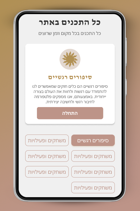
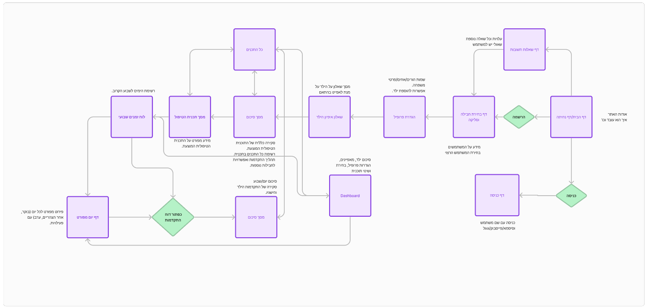
Site Map
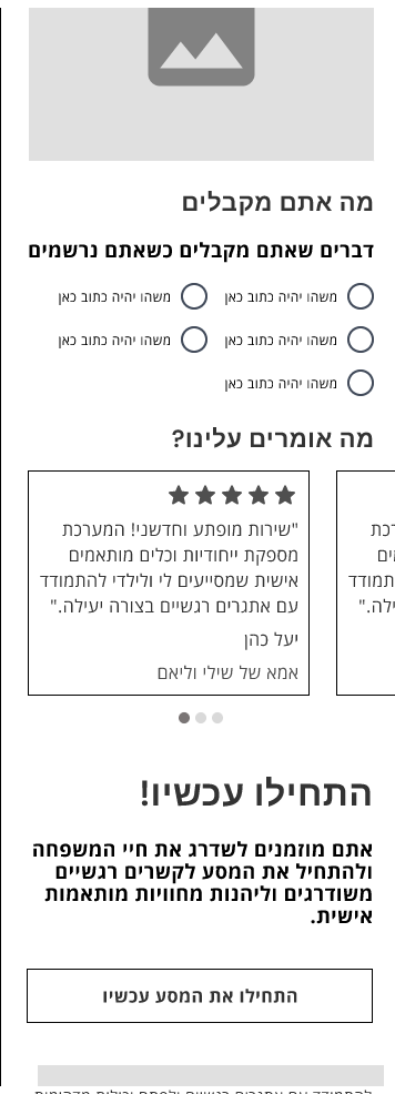
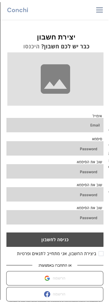
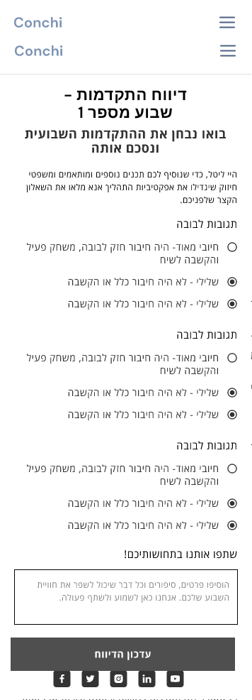
Wireframes


Colors
Primary Colors:
The primary colors chosen for Conchi represent a warm and soothing palette. The golden-brown hue symbolizes warmth and comfort, aligning with Conchi's supportive atmosphere. The light, neutral tones create a sense of calm and simplicity, allowing parents and children to focus on content without distractions. This combination conveys a feeling of home and family while maintaining a professional and trustworthy appearance.
The primary colors chosen for Conchi represent a warm and soothing palette. The golden-brown hue symbolizes warmth and comfort, aligning with Conchi's supportive atmosphere. The light, neutral tones create a sense of calm and simplicity, allowing parents and children to focus on content without distractions. This combination conveys a feeling of home and family while maintaining a professional and trustworthy appearance.
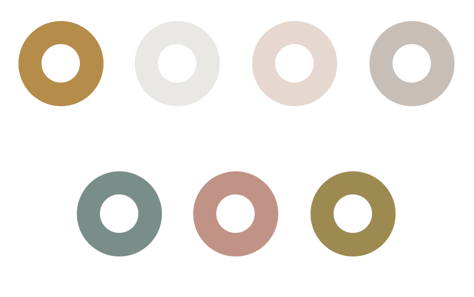
Secondary Colors:
The secondary colors add depth and interest to the design. The green-gray represents growth and balance, the pink-brown adds additional warmth, and the yellow-brown brings positive energy. These colors complement the primary palette, enabling visual highlights without disrupting the overall calming atmosphere.
The secondary colors add depth and interest to the design. The green-gray represents growth and balance, the pink-brown adds additional warmth, and the yellow-brown brings positive energy. These colors complement the primary palette, enabling visual highlights without disrupting the overall calming atmosphere.
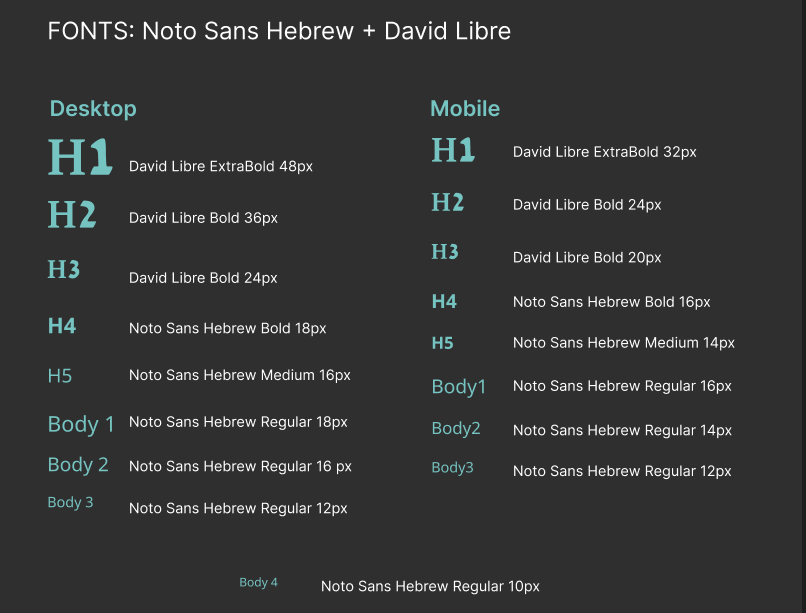
Typography
The choice of David Libre for headings provides a classic and reliable look, suitable for a brand based on expertise and trustworthiness. For body text, Noto Sans Hebrew offers excellent readability with a clean, modern appearance. This combination strikes a balance between tradition and innovation, reflecting Conchi's essence as a platform that blends traditional parenting values with advanced technology.